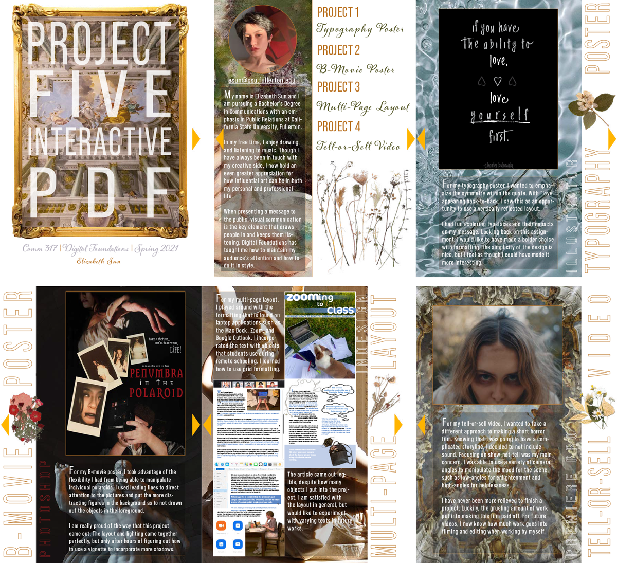
Elizabeth Sun
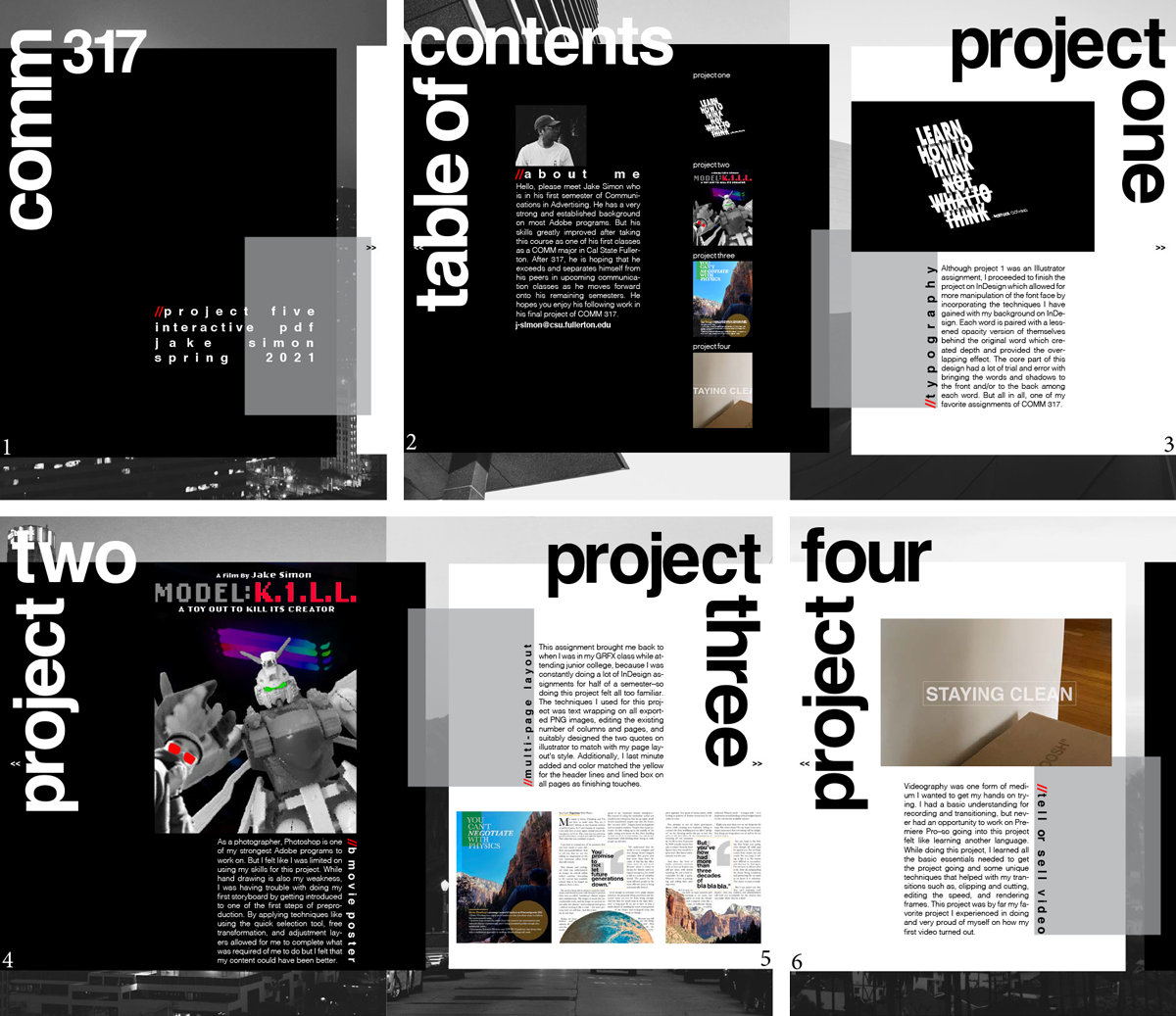
Jake Spring
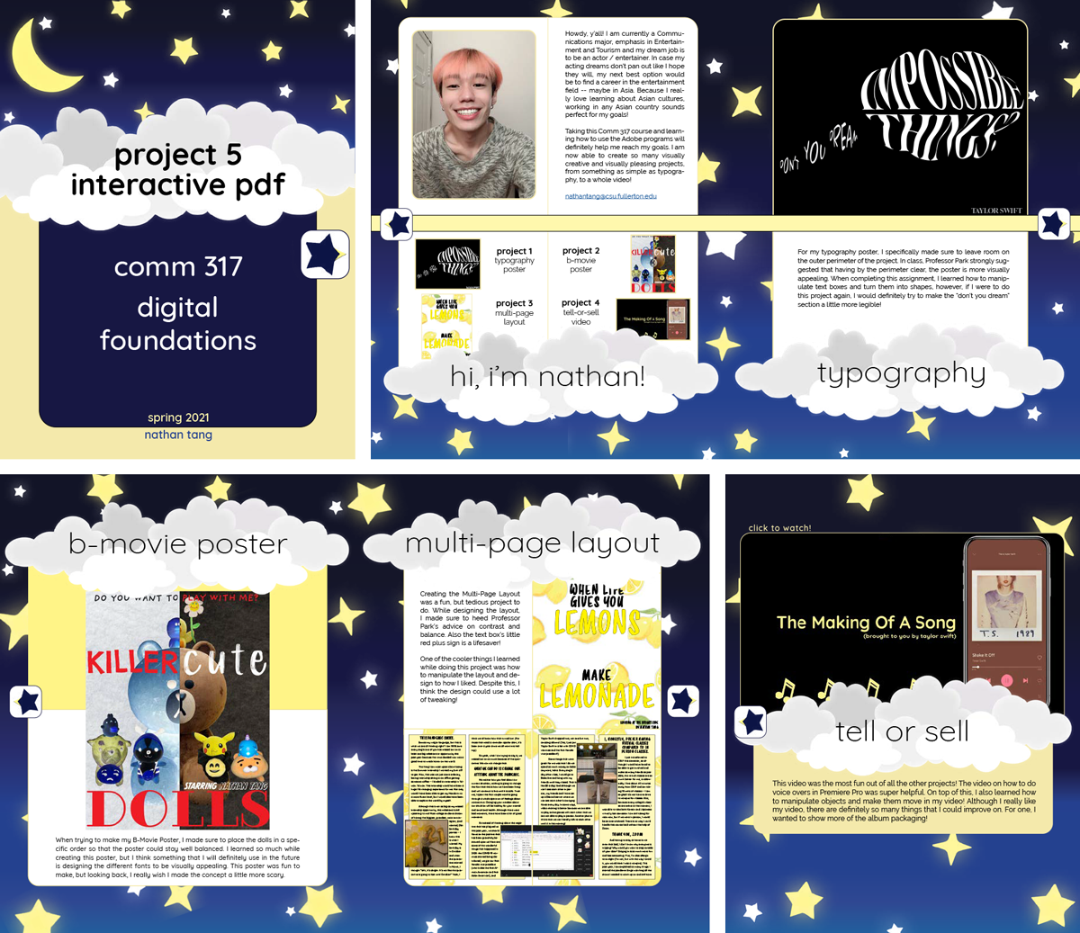
Nathan Tang
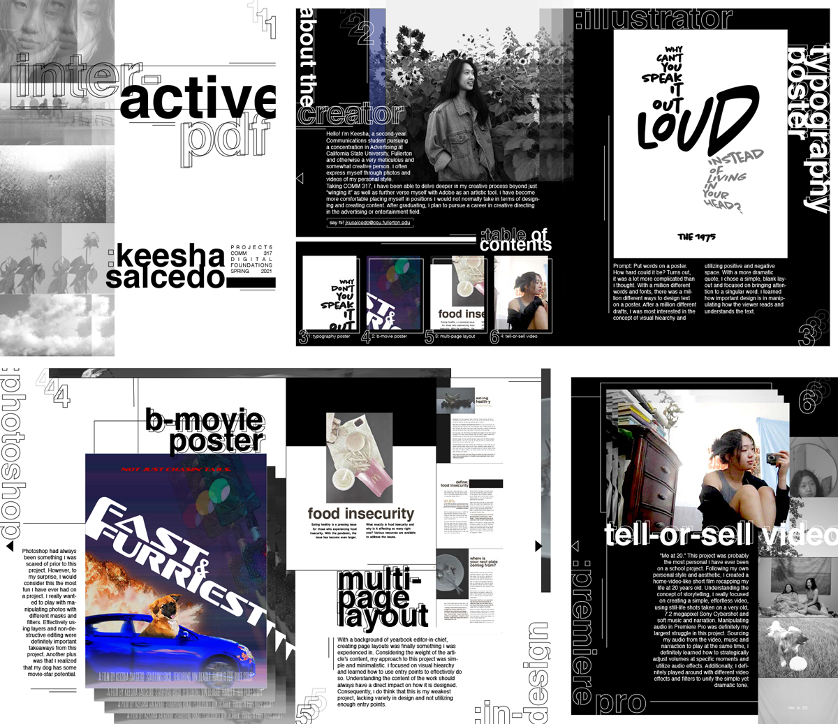
Keesha Salcedo
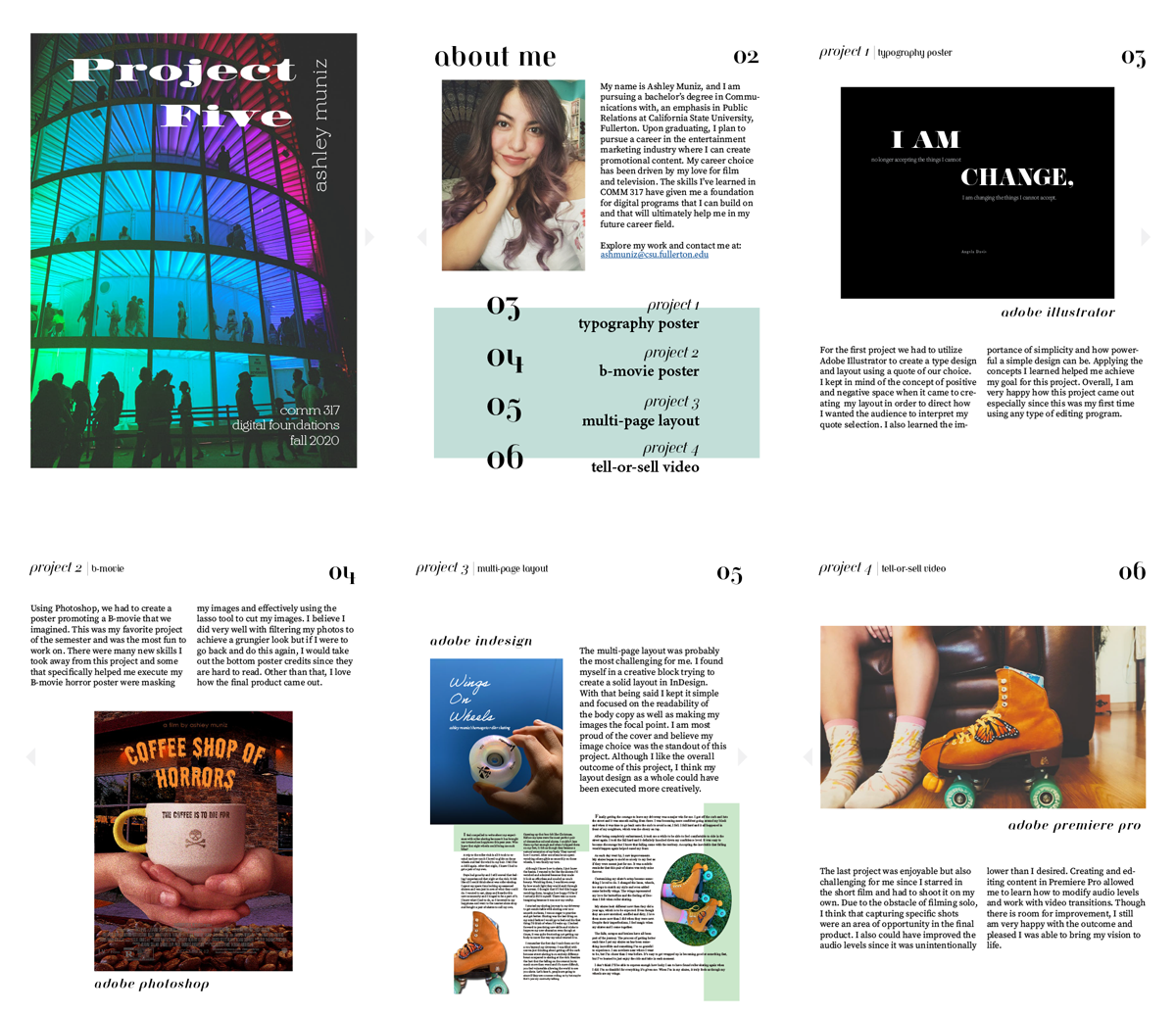
Ashley Muniz
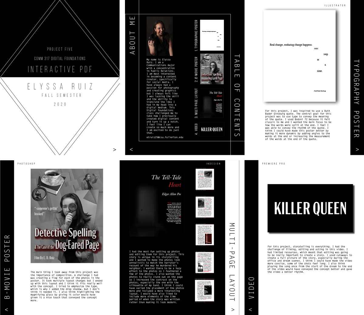
Elyssa Ruiz
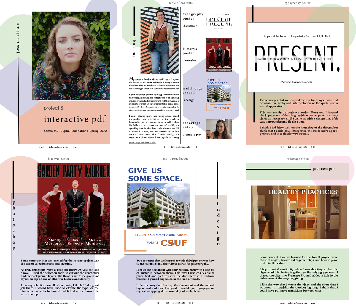
Jessica Aitken
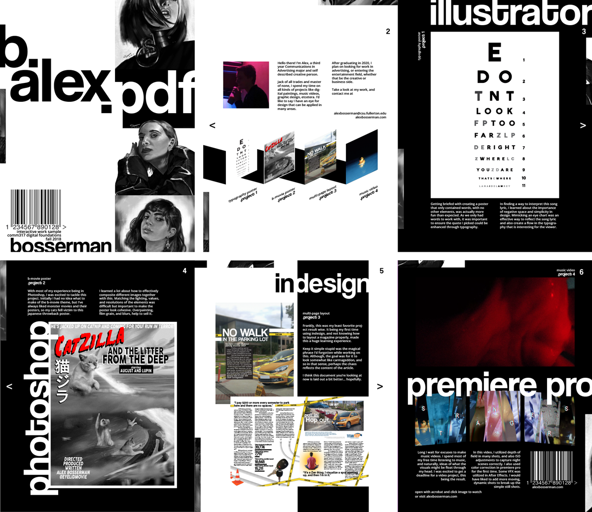
Alex Bosserman | Alex is a multi-talented visually creative person, which this project shows well. The trick with this type of a piece is to show your visual style without interfering with the viewer's ability to appreciate each individual project. Alex accomplished this very well.
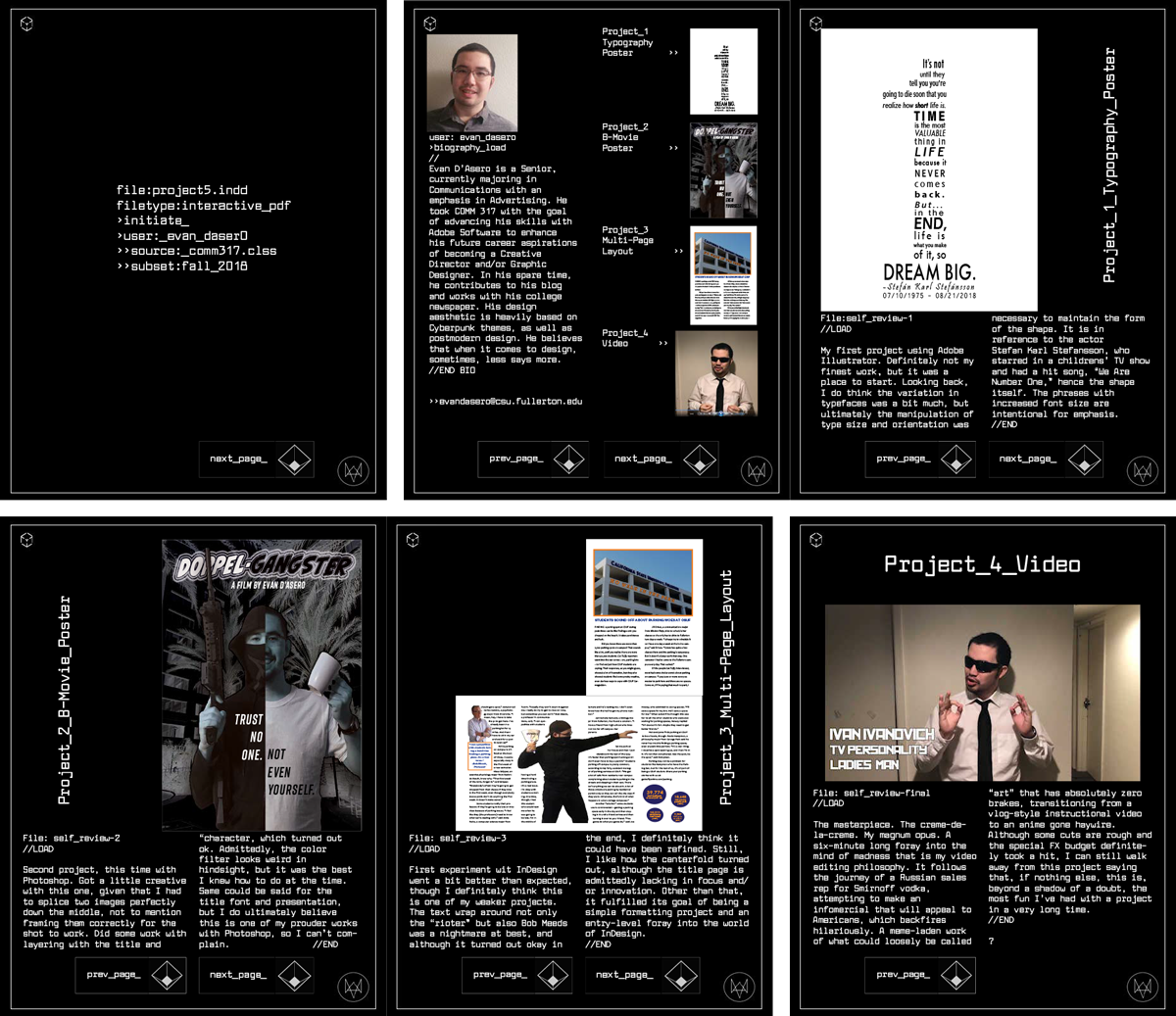
Evan D'Asero | Evan created a visual theme for his brochure. Basically, he hacked his own file following his movements in Comm 317. He was never supposed to see this information, but at least he layed it out well.
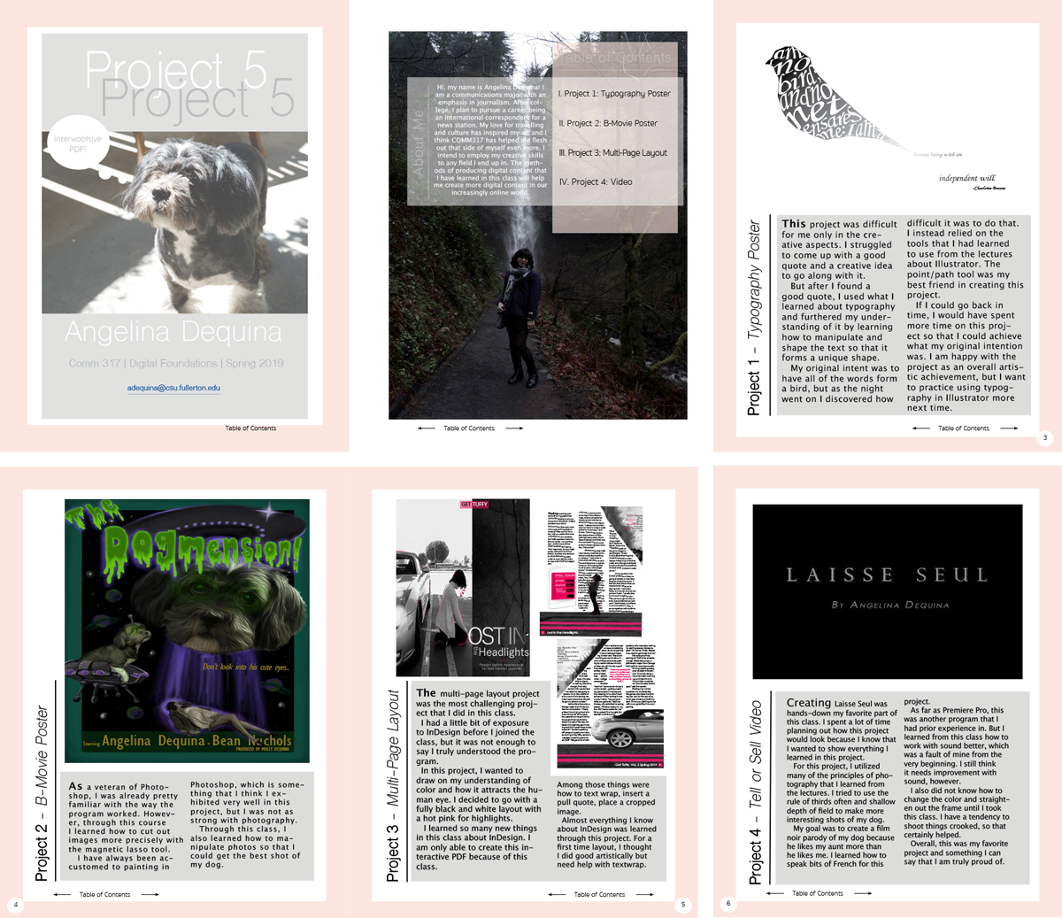
Angelina Dequina | Angelina’s layout gives the projects as much display space as possible so the reader can see them easily. But the writing is the real star here. The reflections and self critiques give the reader a lot of insight into her thinking as she approached each project, which is really helpful to a potential employer reviewing your portfolio.
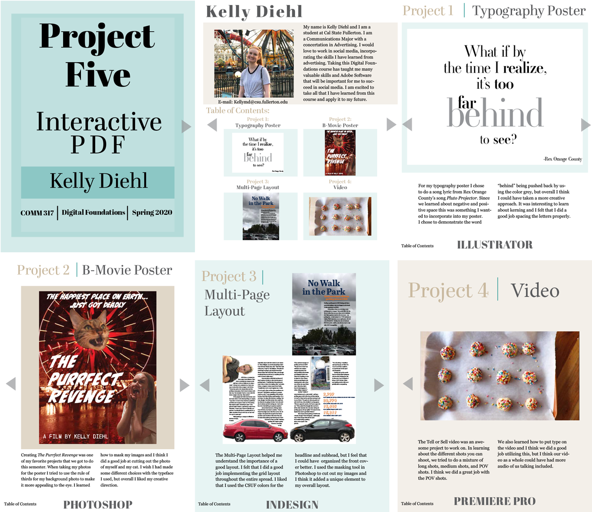
Kelly Diehl
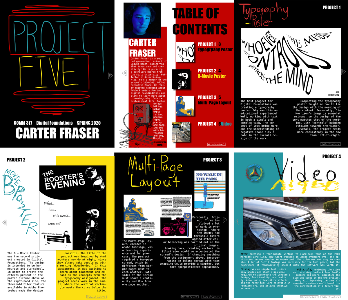
Carter Fraser
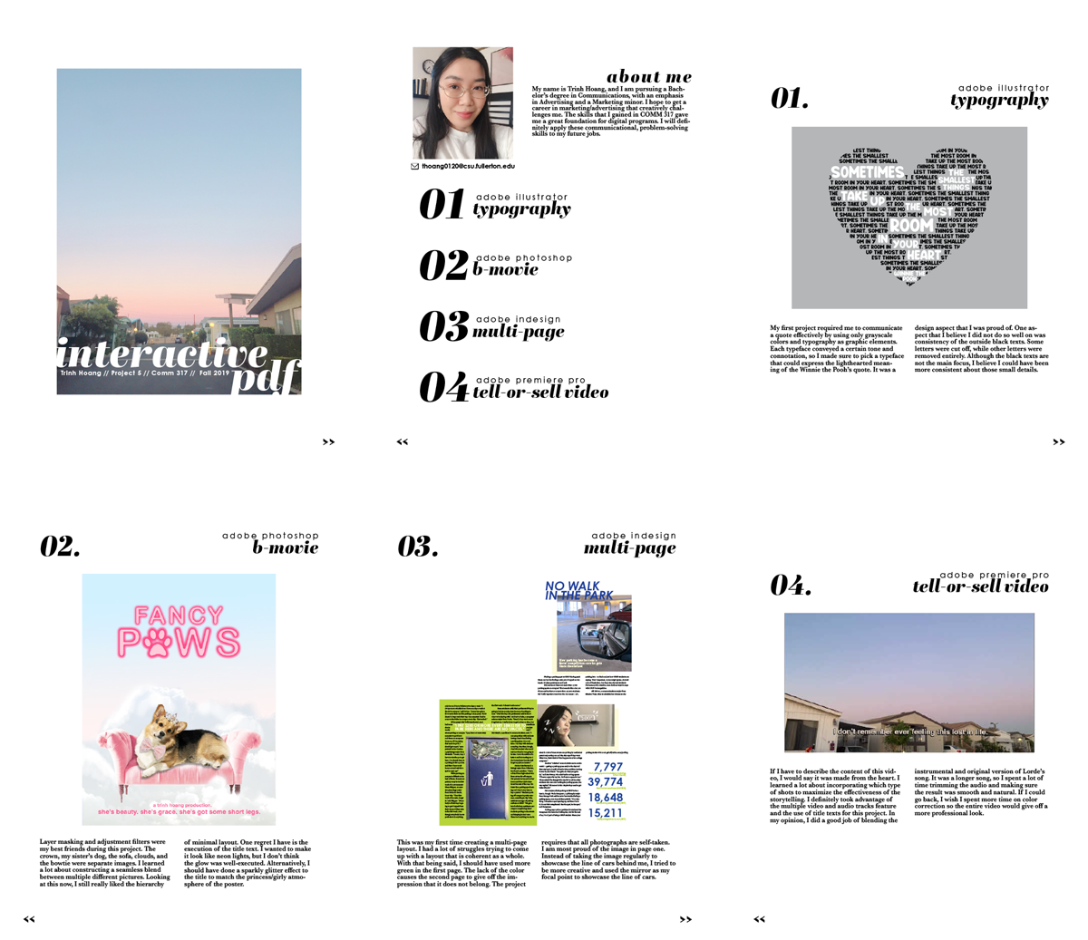
Trinh Hoang
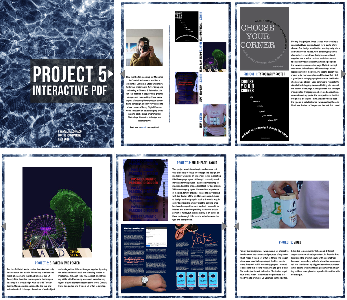
Chantal Maldonado
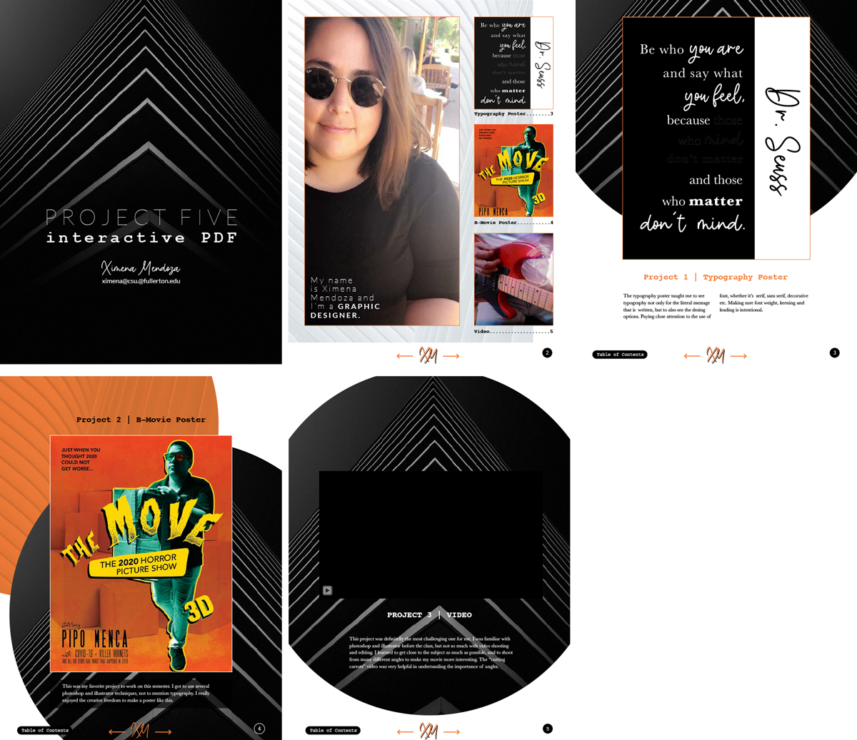
Ximena Mendoza
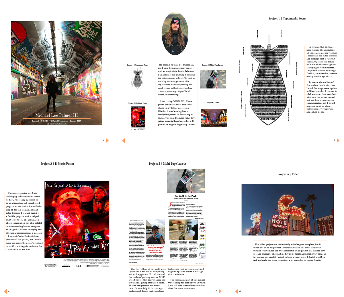
Michael Palmer | A strong visual and editorial point of view, good use of white space and a dash of subtle color in the page turn buttons and piping lines as a unifying element.
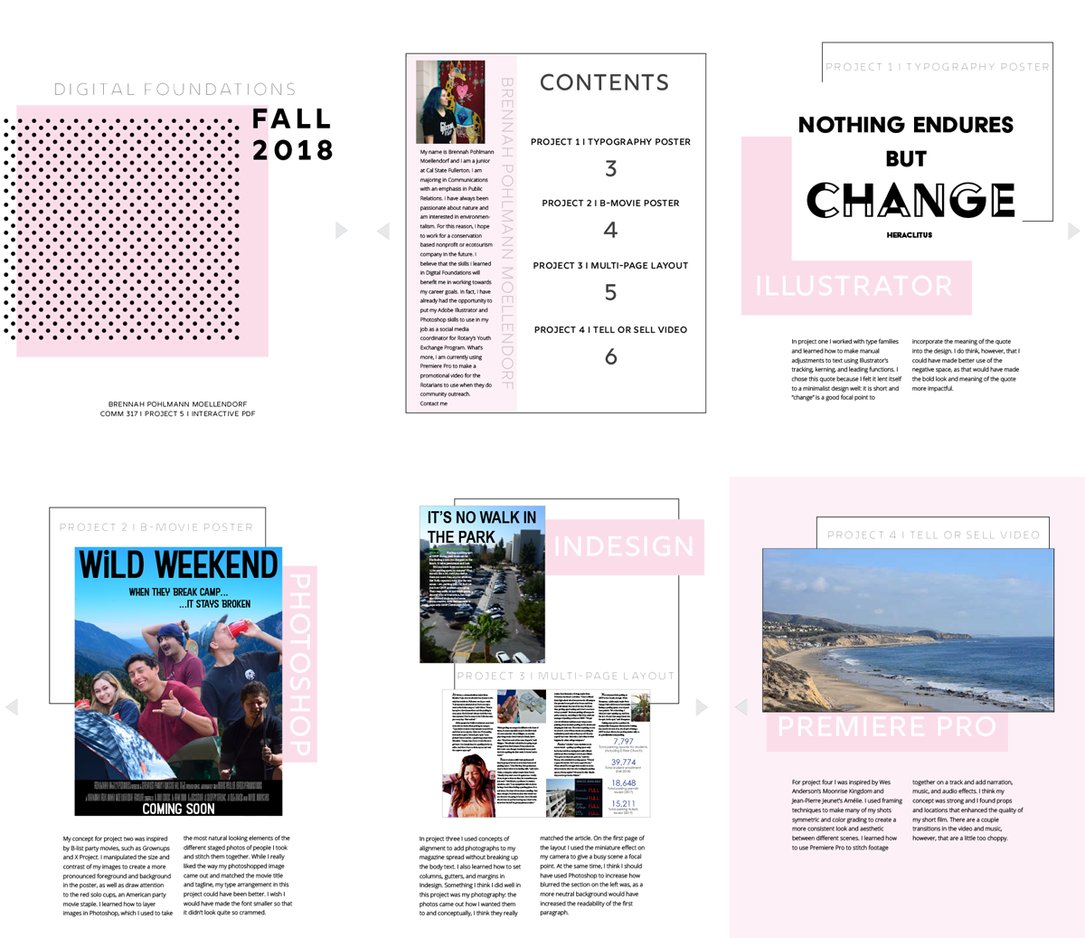
Brennah Pohlmann Moellendorf | Brennah proved once again that black and pink go very well together. She also created a light, fun design that - because of her good use of color - tracks well from page to page, and shows her class work nicely.
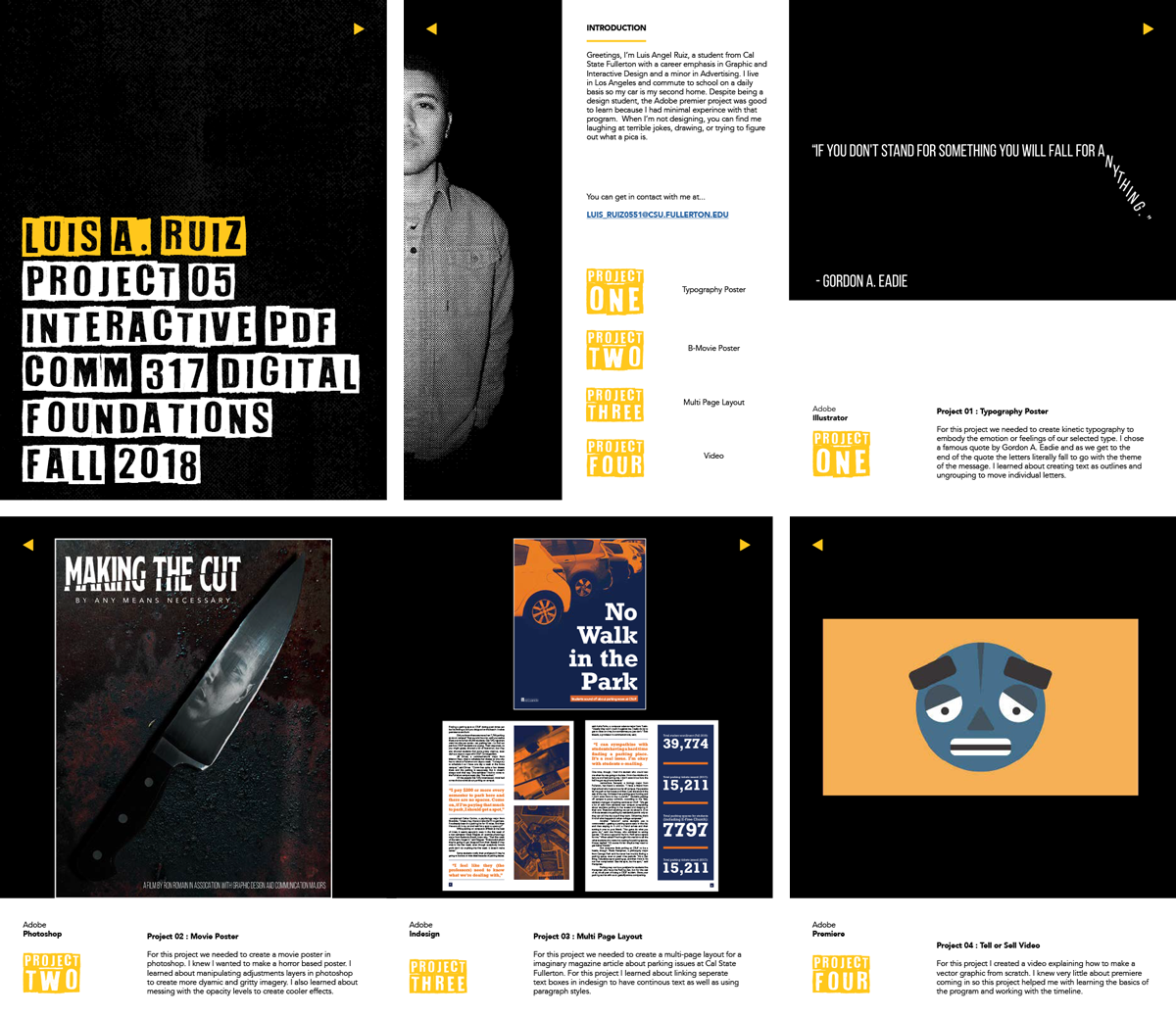
Luis Ruiz | Another example of a portfolio brochure that shows the student's visual style while also presenting his work well. A strong use of black and white, plus a great use of negative space on the front cover and pages 2 and 3.
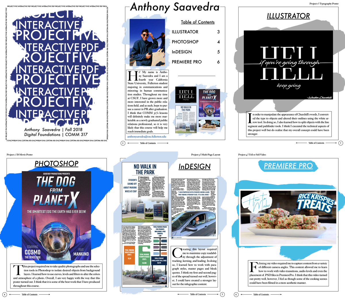
Anthony Saavedra | The wild, irregular background shape is the element that unifies all the pages and Anthony was confident enough in its function to go ahead and change the color and value of it on each page. A simple but effective unifying device.
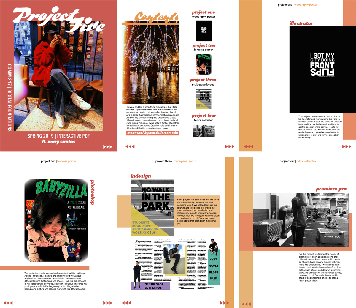
Mary Santos | The magazine layout approach used by Mary worked very well with this type of content. Her self-portrait images and design style really give you a sense of who she is both as a communicator and a personality. Also, note that the pages are not crammed top to bottom with content. The white space around the elements make it inviting to engage with the content.
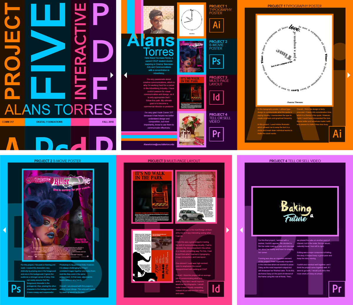
Alans Torres | My guess is that Alans likes color. Specifically, bright, raw colors. And, boy, did he commit to them. Often an approach such as this can get visually very busy and make it hard to view/read the content. Due to lack of contrast between the type and the background, readability is a bit tough in some places. But the visual content actually comes through very well. So while Alans' colors are wild and out of control, his design is refined, contolled and directs the viewer's eye effectively.
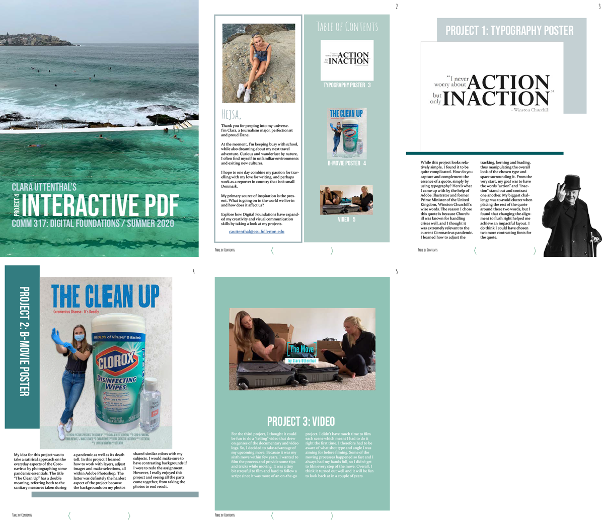
Clara Uttenthal
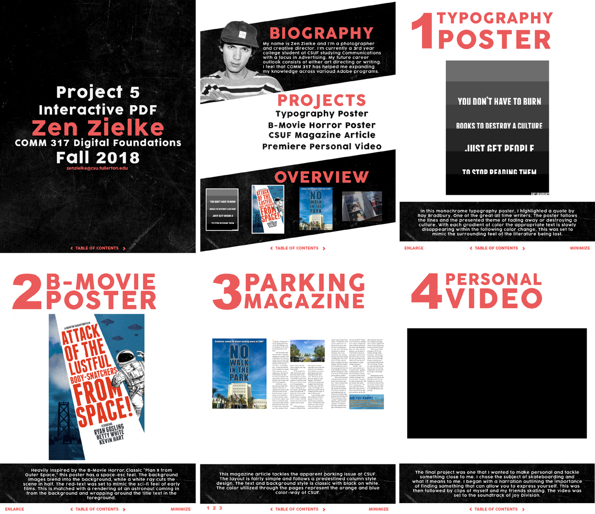
Zen Zielke