Alex Bosserman | This is a treasure hunt layout. The more you look the more you find. It's fun to look at but hard to do. Everything about editorial multi-page layouts is important. Every element's size, position and relationship to the negative space. Every font choice, size, leading, alignment, column width, column gutter, et al. If you do a treasure hunt layout leave lots of time for finessing.
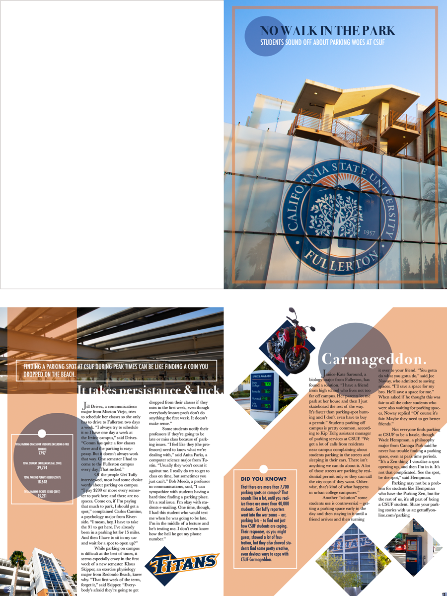
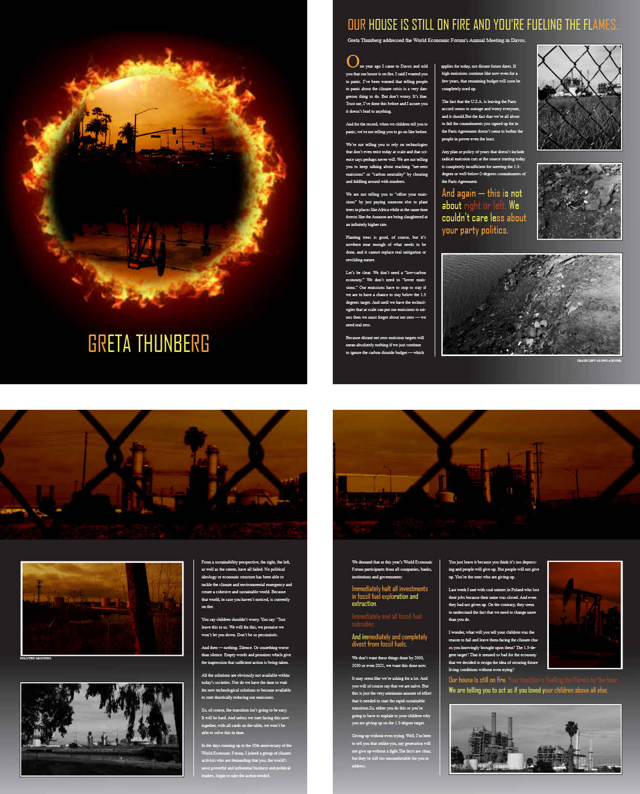
Cassie Chang | This layout is a good example of using color, value and shape to create unity and depth. It’s very clear what’s in front, what’s in back and how all three pages are tied together with these three simple elements that every layout artist has in their toolkit.
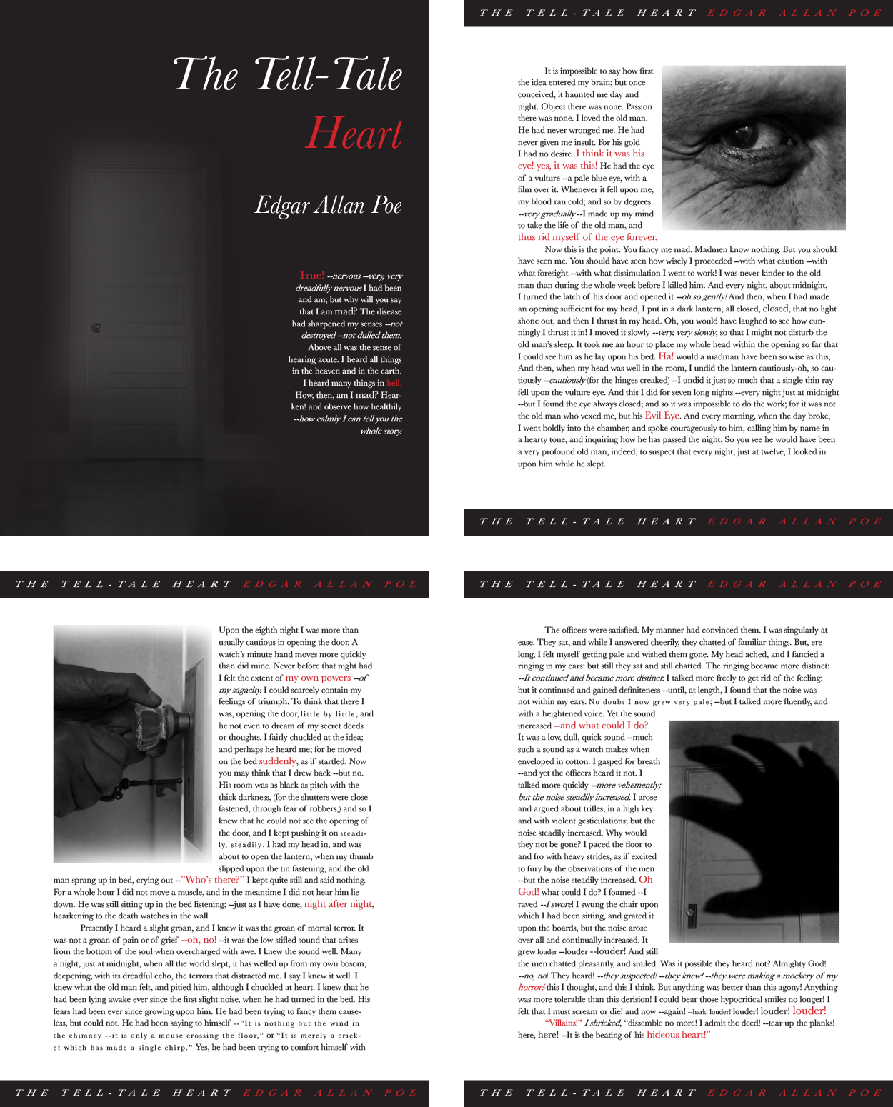
Aja Duran | This is a good example of a designer imprinting their own style and point of view on a layout. This is a beautiful layout with great photographs and sensitivity to type, but it would not be appropriate for all audiences and publications. You must always keep your audience in mind – if you don't immediately engage them, you've lost them.
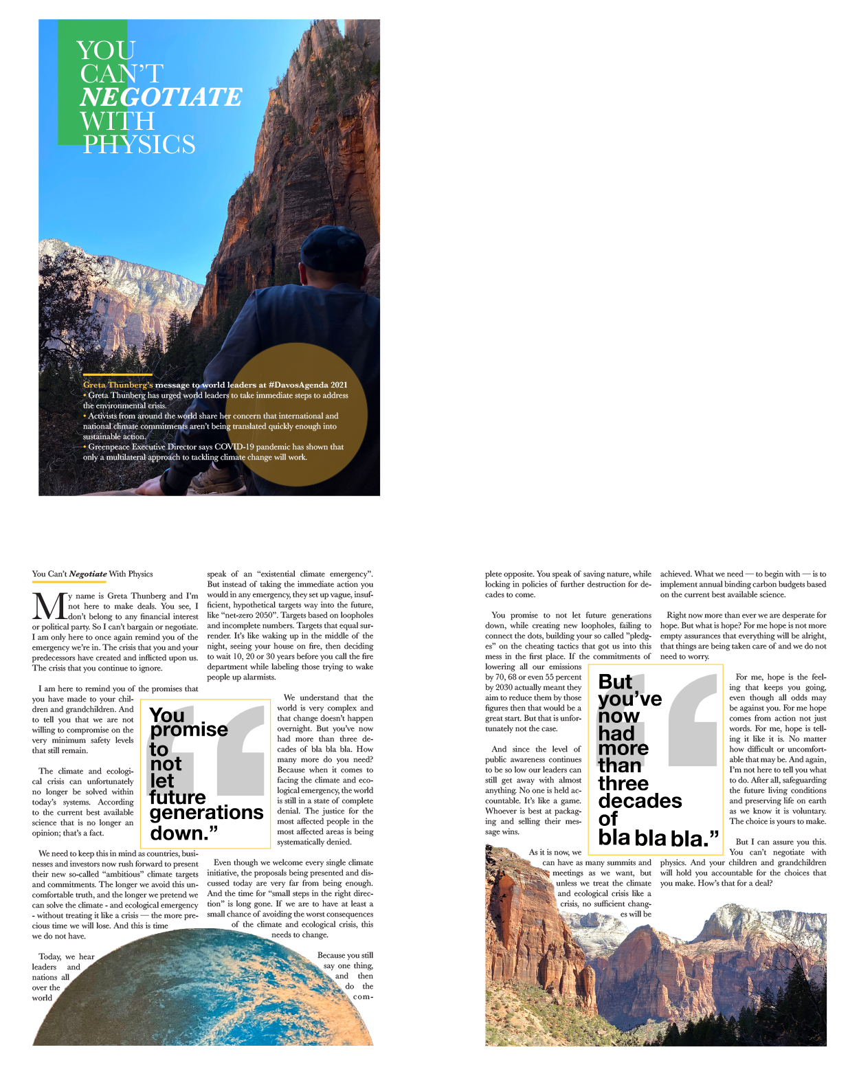
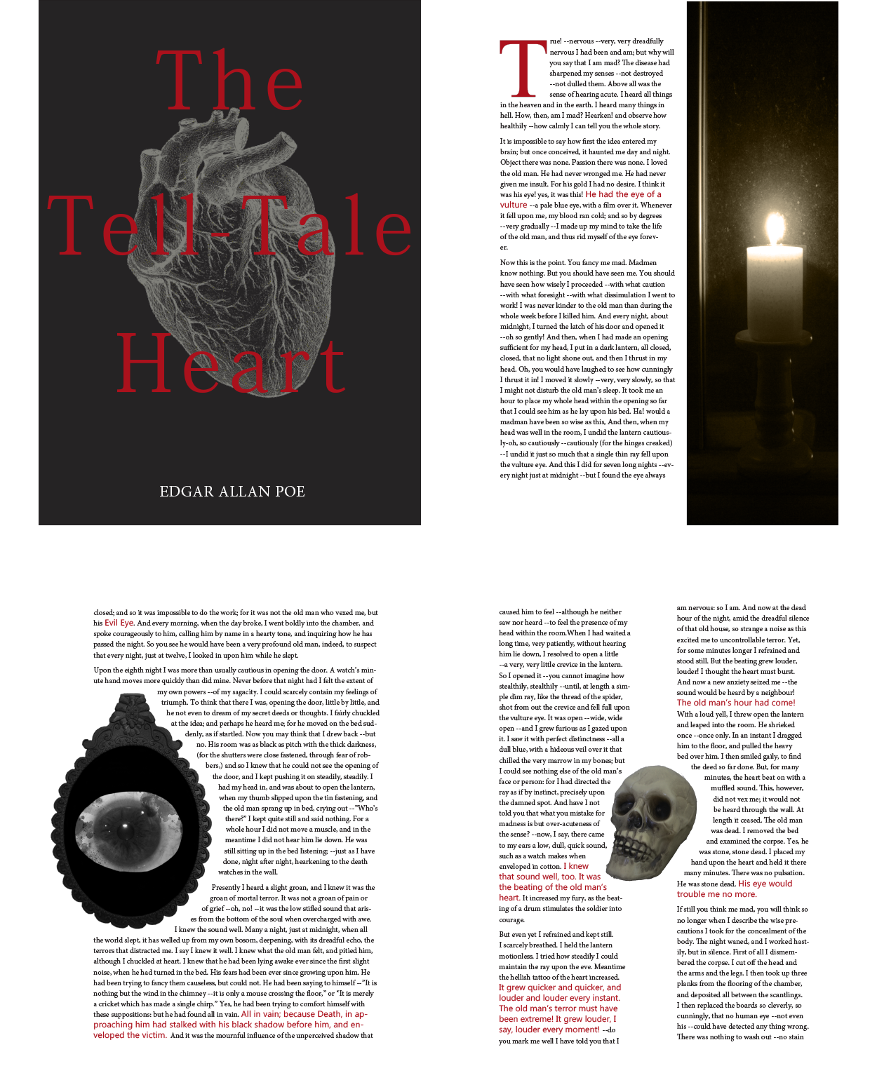
Kalila Lam | This is a great example of concept driving the layout. Anytime you can do that you're heading towards a powerful piece of communication. Remember: Layout is just arranging elements in a space. Concept is the idea that drives your layout decisions. A good concept can survive a weak layout. But a bad idea cannot be saved by a slick layout - you're just rearranging the chairs on the deck of the Titanic.
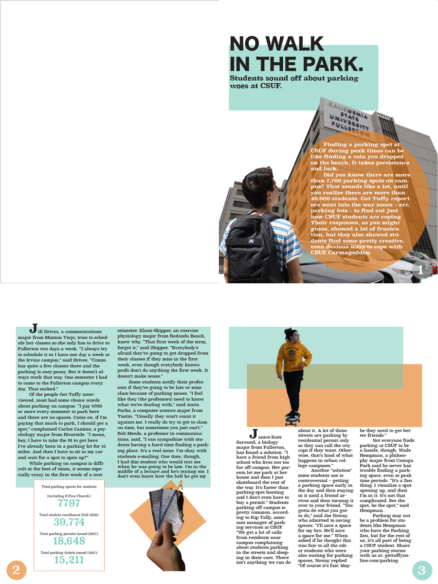
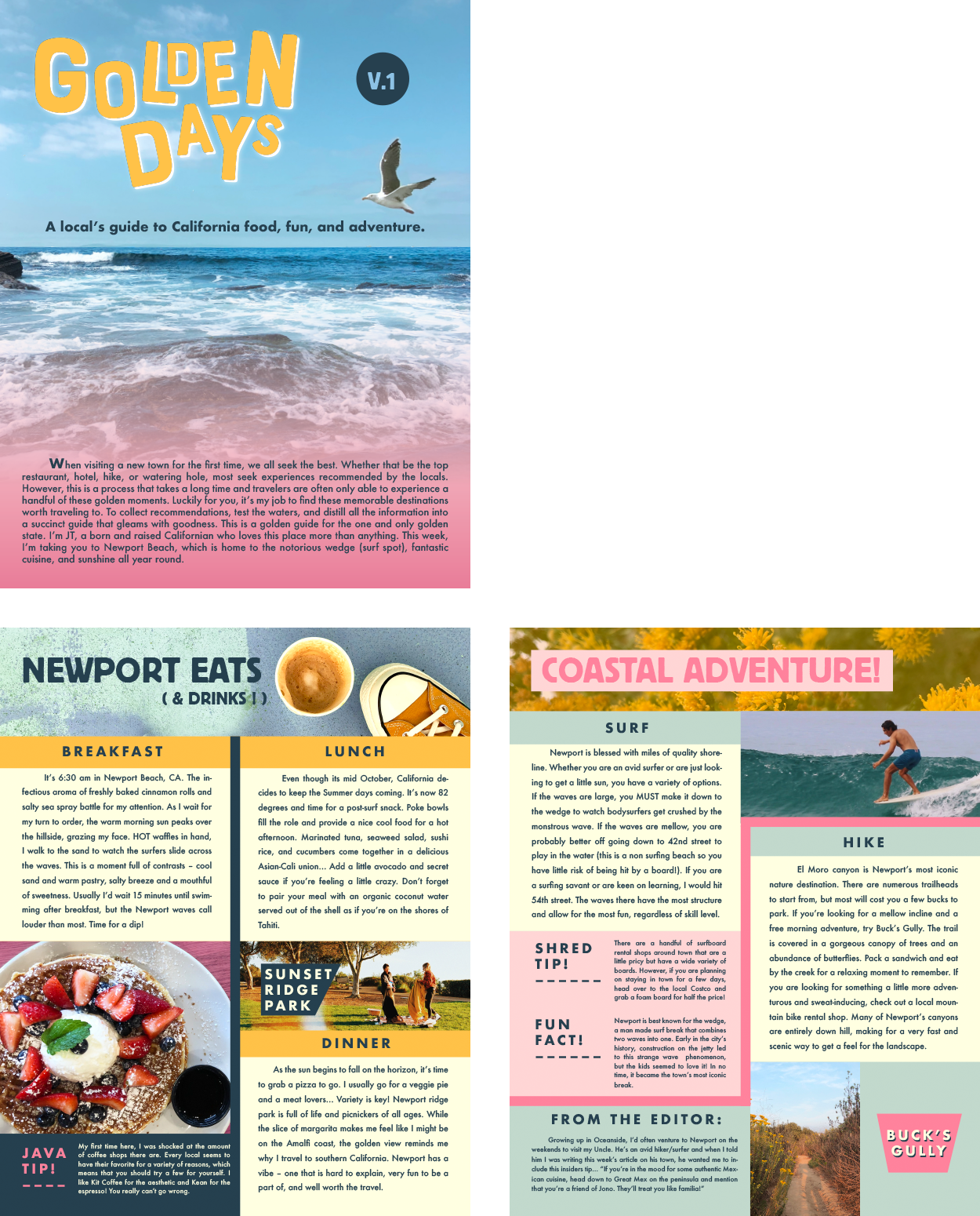
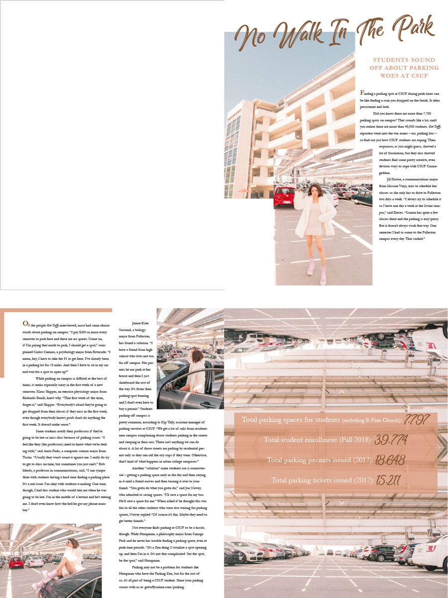
Brandon Le | This layout also incorporates color, value and shape. But the really nice touch on this one is that the designer paid attention to the story, and created a composition that comes straight from the narrative. This is a good tip to keep in mind. Pay attention to main themes and points that come from the text and let them guide your design.
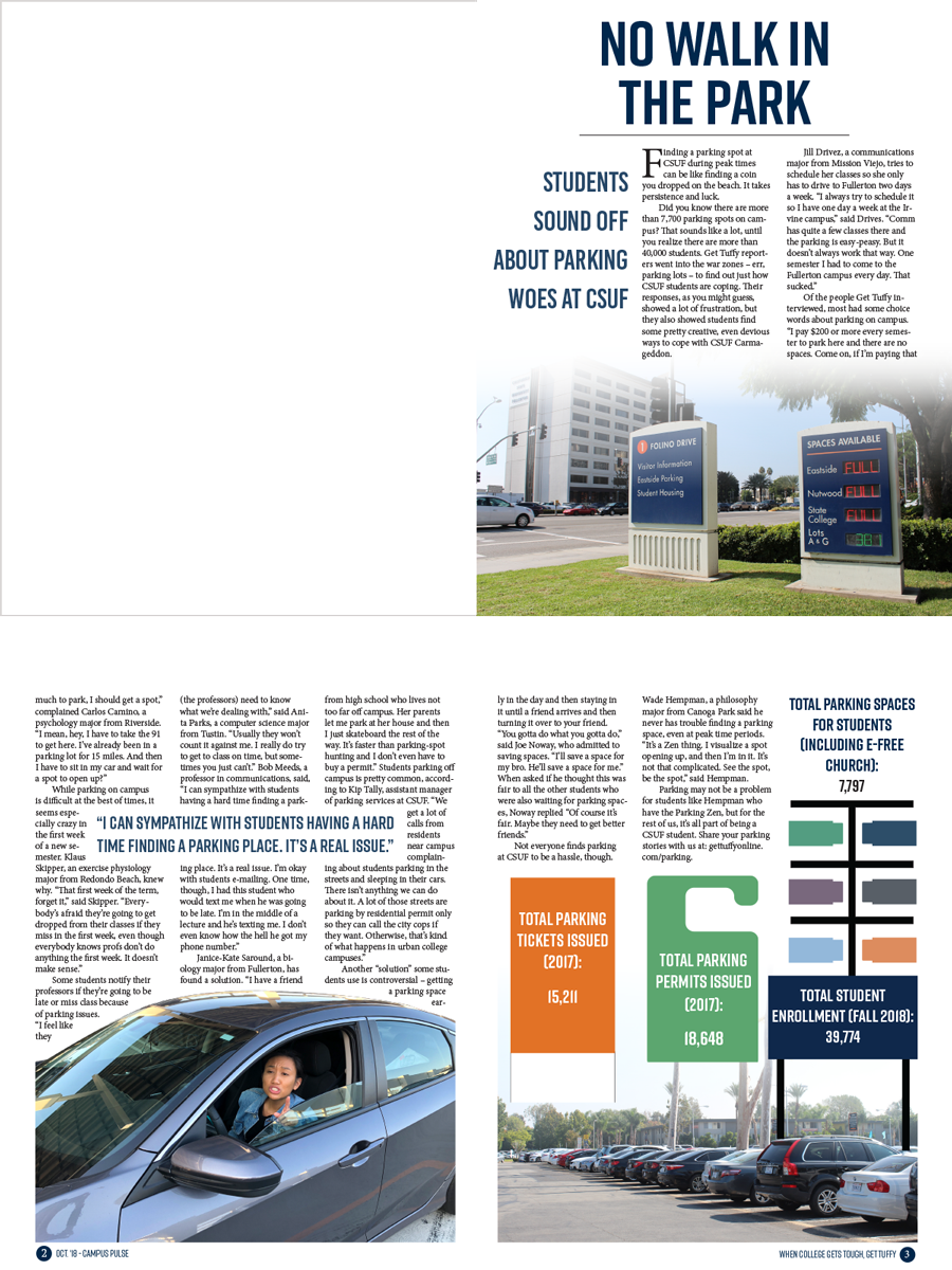
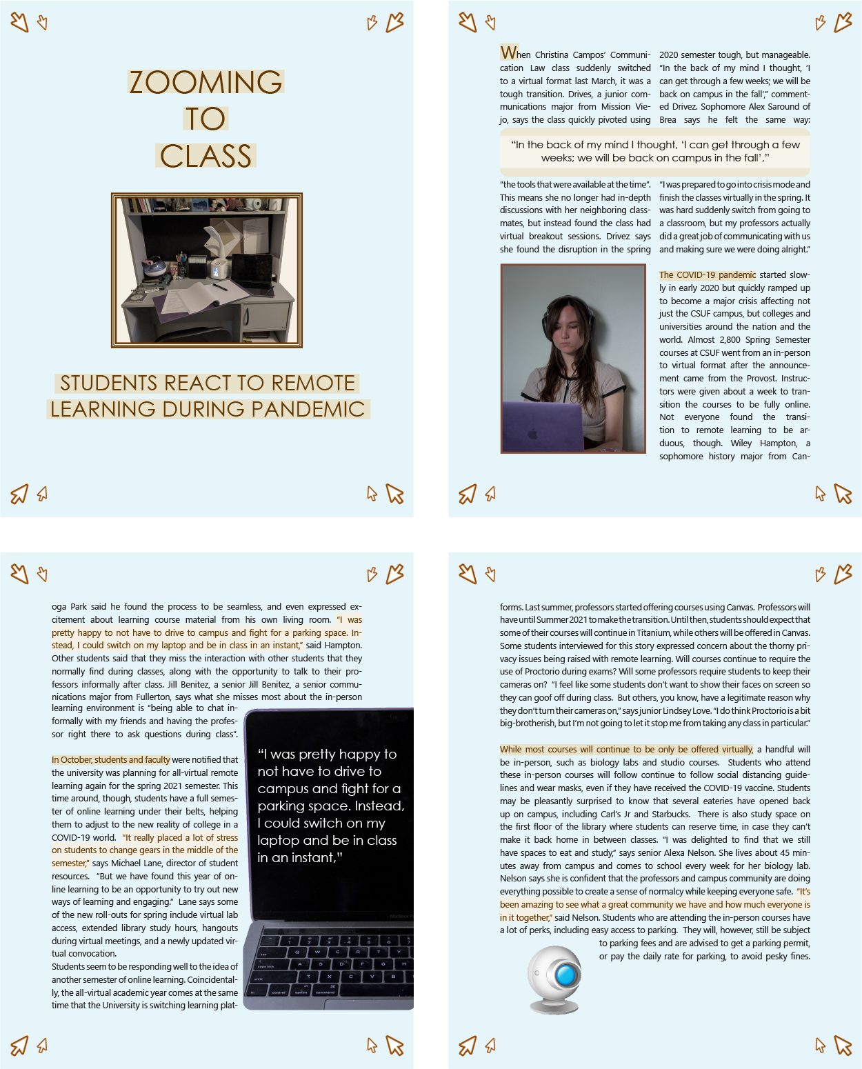
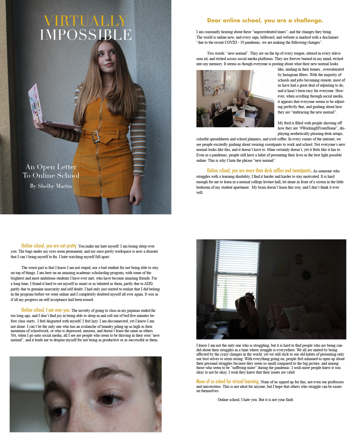
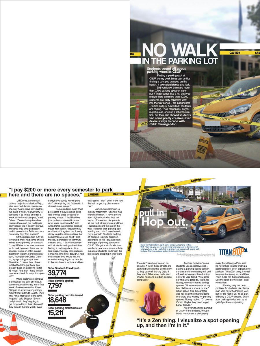
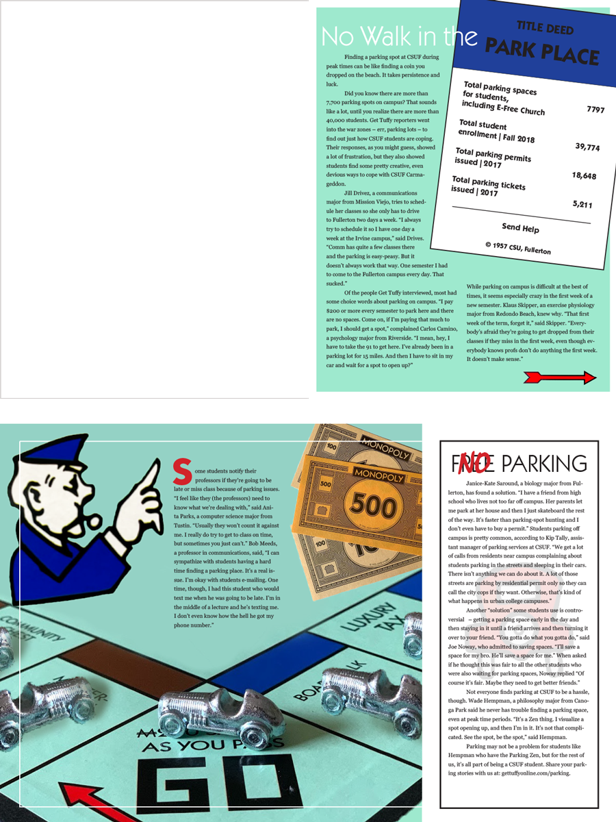
Anthony Saavedra | The graphics and type decisions are really good here. Everything looks like it’s exactly where it belongs in this layout.
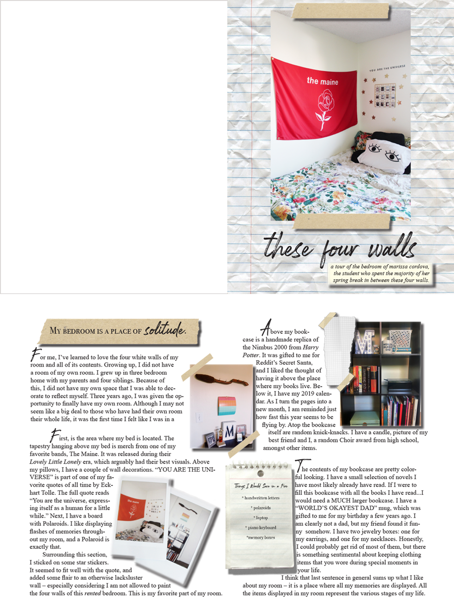
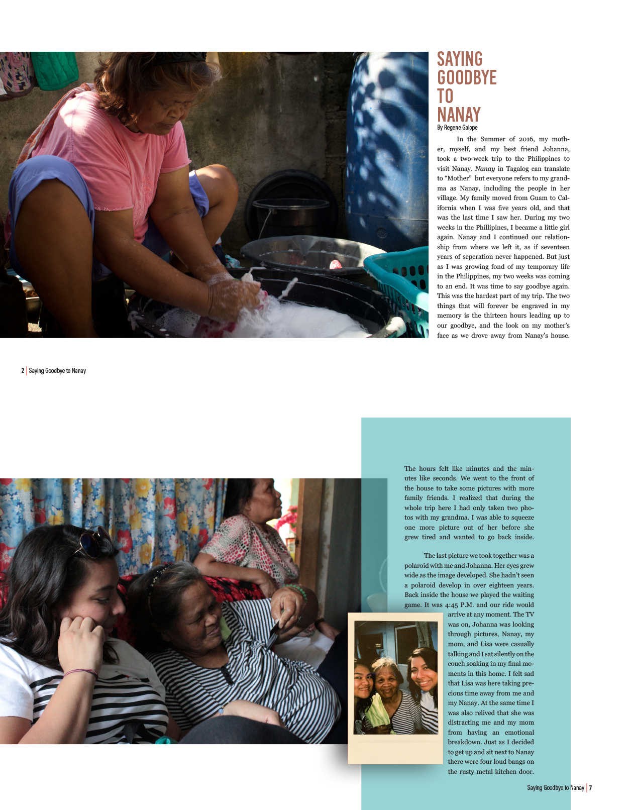
Marissa Cordova | I loved how Marissa used crumpled paper as the page backdrop, which added depth to spread's opening. Inside, the use of drop shadows, initial caps and rag right text provides visual interest in addition to the content. A side note: I allowed students the option to write their own stories and take their own photos for this project.
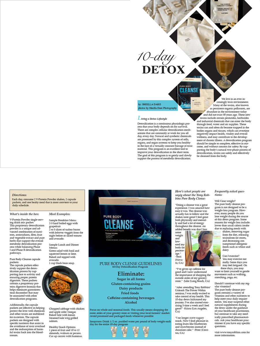
Sheila Dare | A creative visual approach with the square images on the opening page, adding perhaps another interpretation to "blockage." The typography is well thought out and presented, though I'd like to see more even spacing in the gutters.
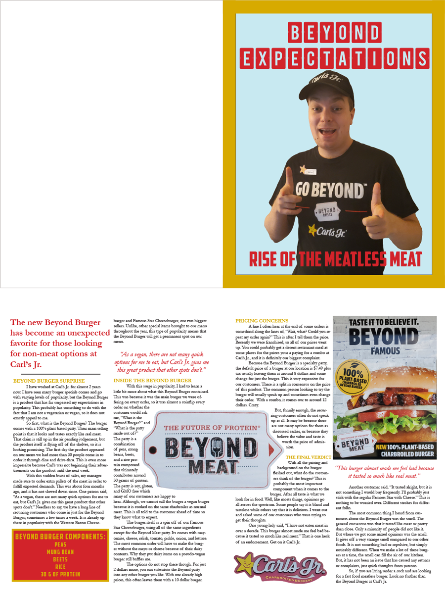
Jacob Harris | How do you show meat that's different, even though it doesn't look different? You don't. To borrow an advertiser's phrase, show the sizzle, not the steak. So Jacob used a picture of himself to show the enthusiasm for Beyond Meat, and the traditional text treatments inside to carry the reader's eye through the two pages.