

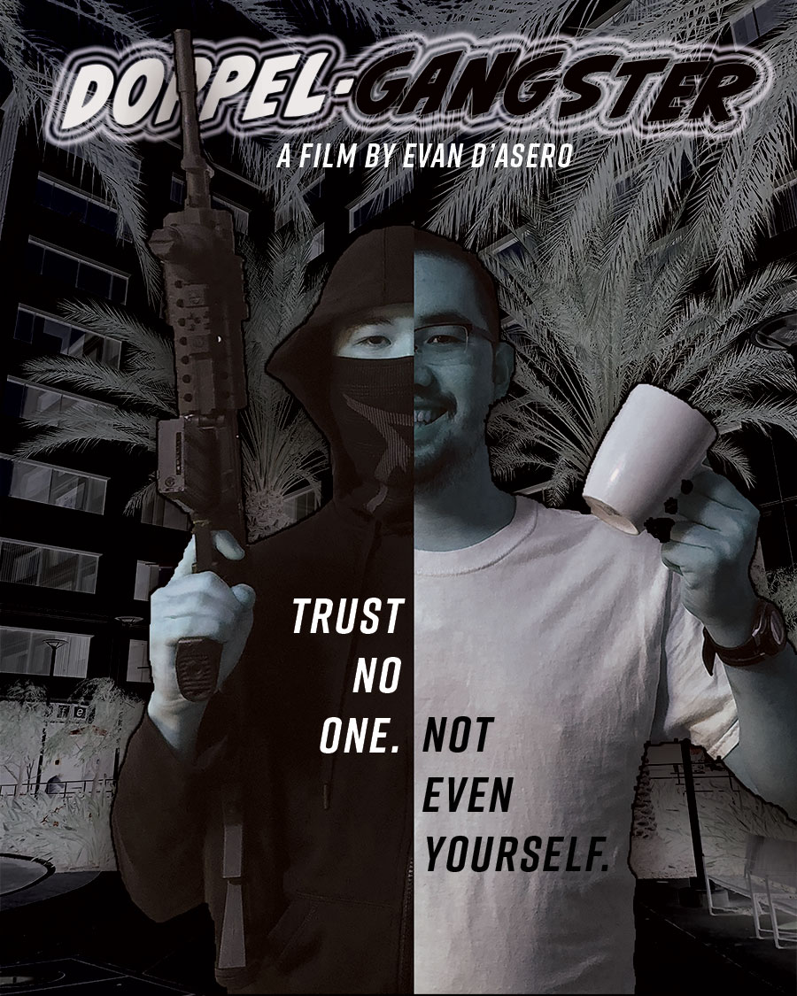
Evan D'Asero | Great movie concept, title and tagline. Strong visual hierarchy pulls all the elements together to create a great poster. Use of black and white, plus positive and negative elements reinforce the good vs evil concept.
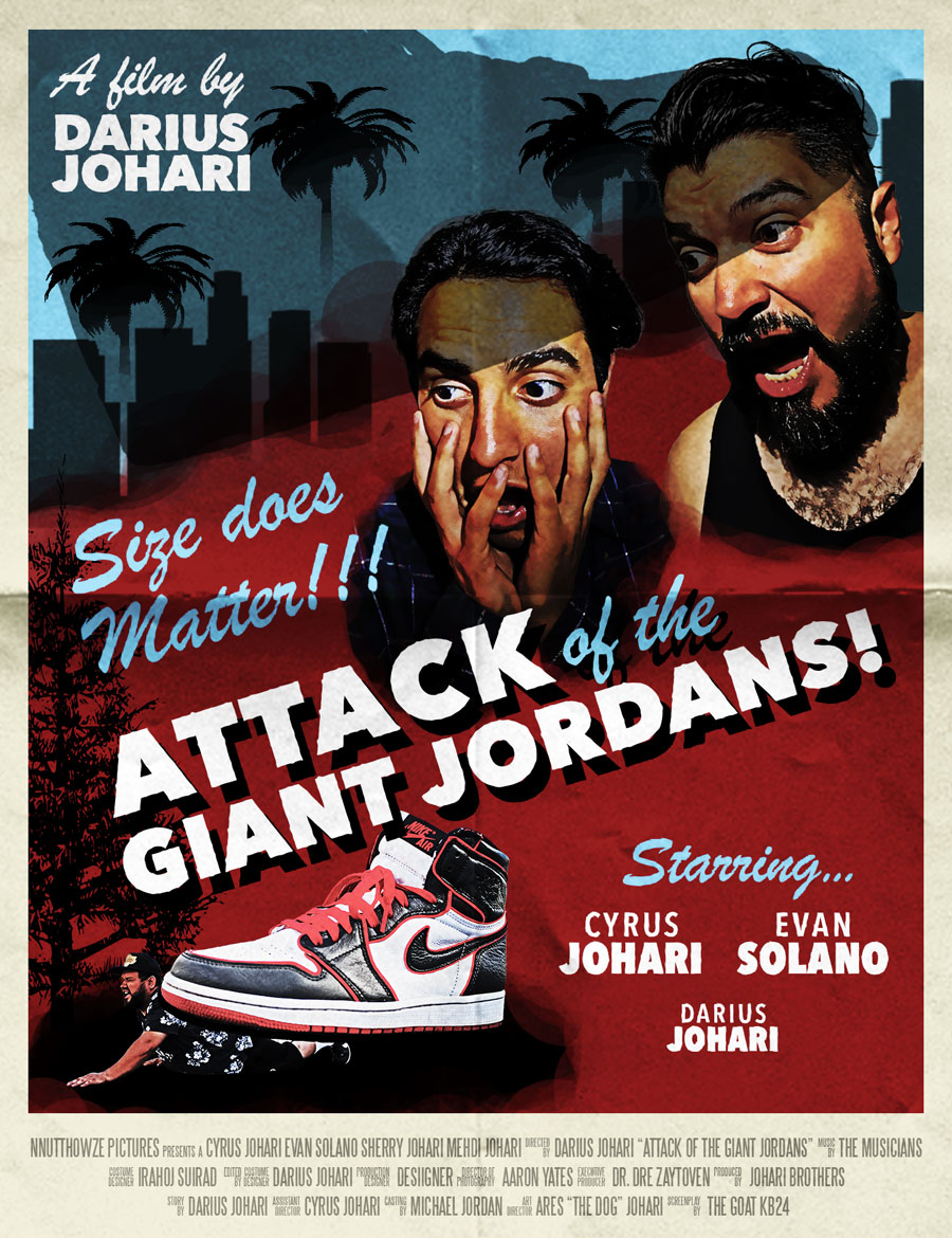
Doug De Wet | Strong visual hierarchy and composition – in combination with a funny idea and copy – make for a very impactful and entertaining poster.
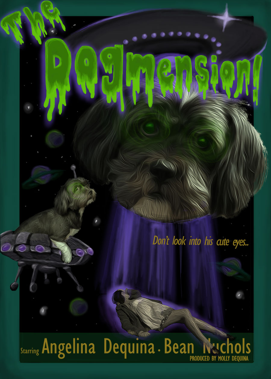
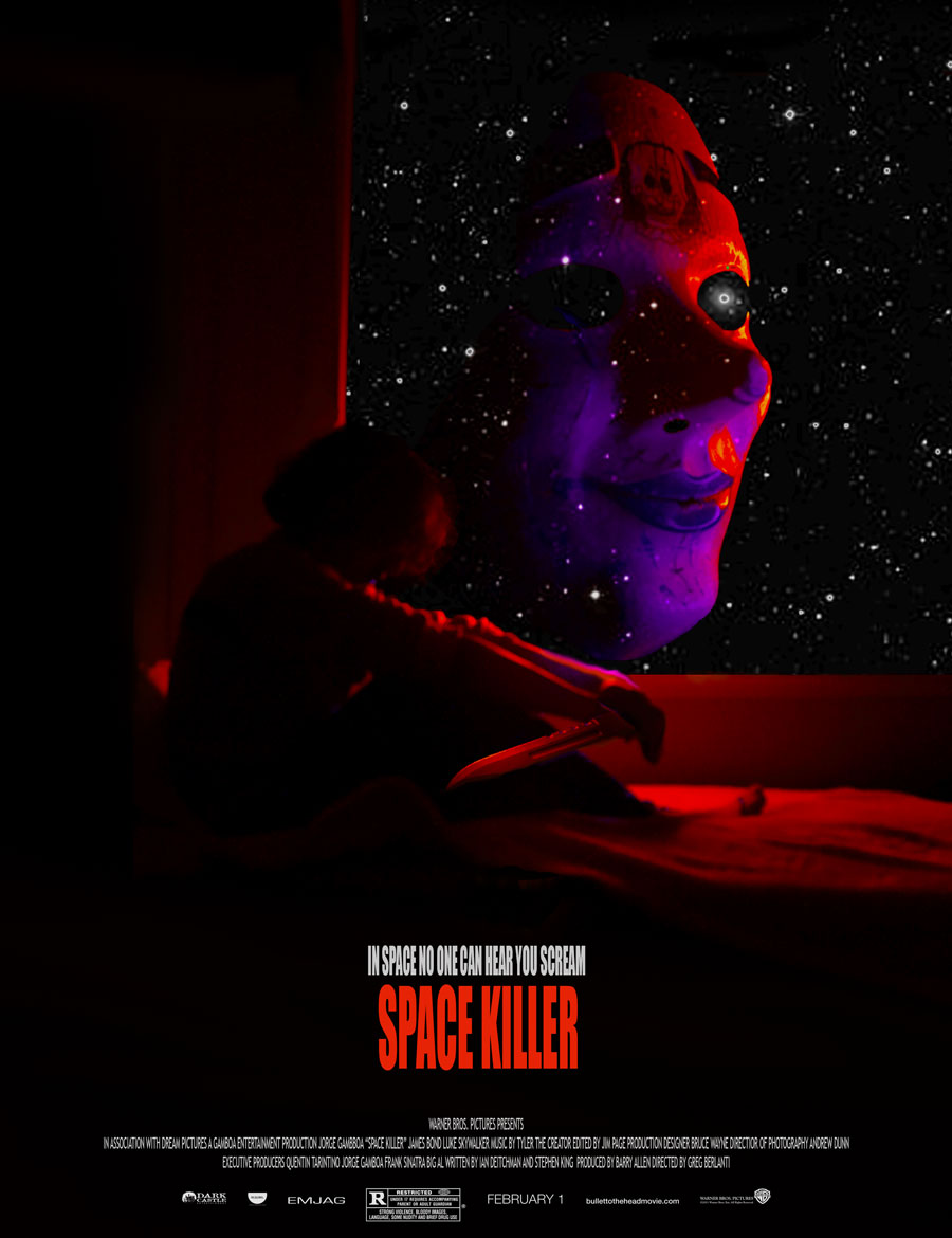
Angelina Dequina | This is a somewhat complex composition with the type, the filters and glow effects helping create the extra-terrestrial feel. The planets in the negative space give the poster a sense of depth.
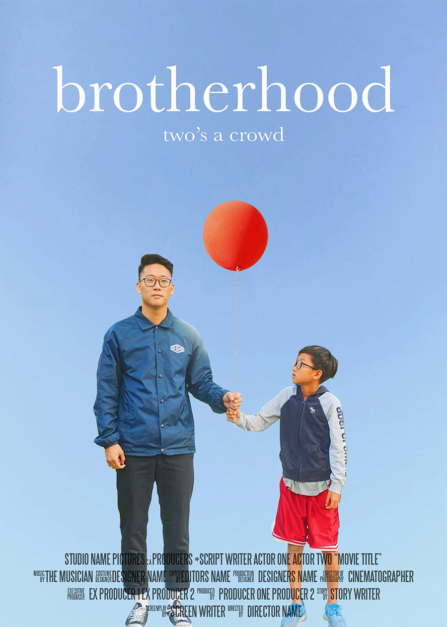
Stu Dent | Nice and clean, simple. The selections are well done and even the sky gradient is effective. (This project was built from four separate images, brother 1, brother 2, sky and balloon).
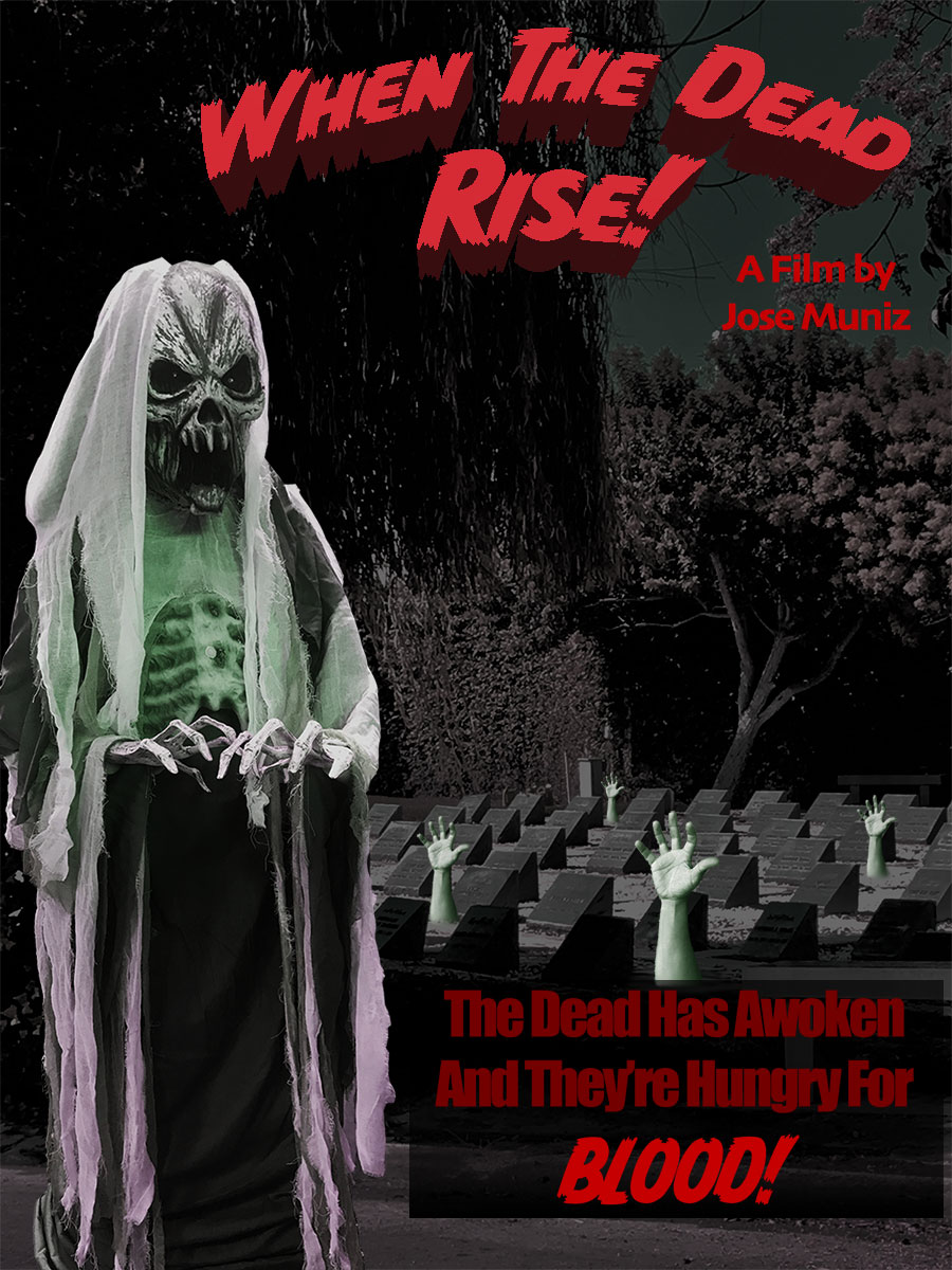
Jose Muniz | This one’s campy and over the top, and that’s what works about it. Nothing says B-Movie horror flick like a glowing skeleton and hands coming out of the ground.
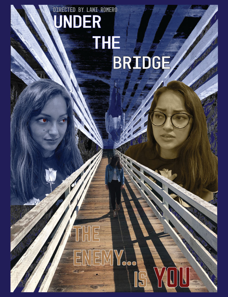
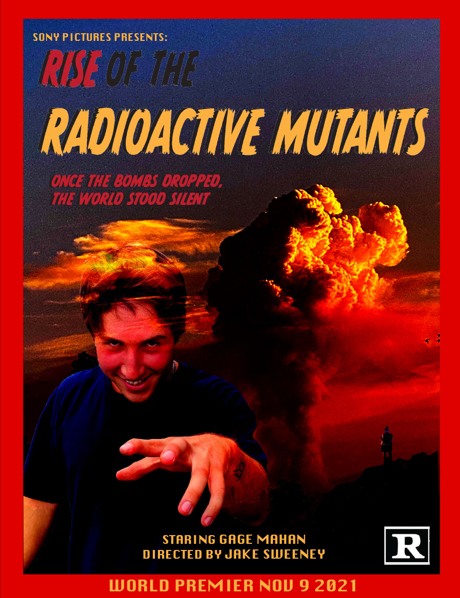
Lani Romero | Often symmetrical compositions can be static and not effectively move your eye around the layout. In this layout, however, the symmetry allows the viewer to focus quickly and easily on the differences between the hero... and the enemy.
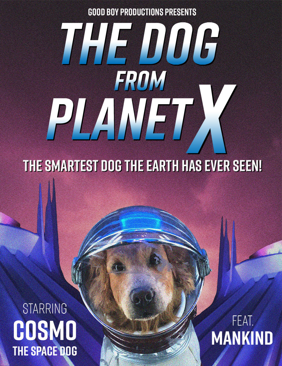
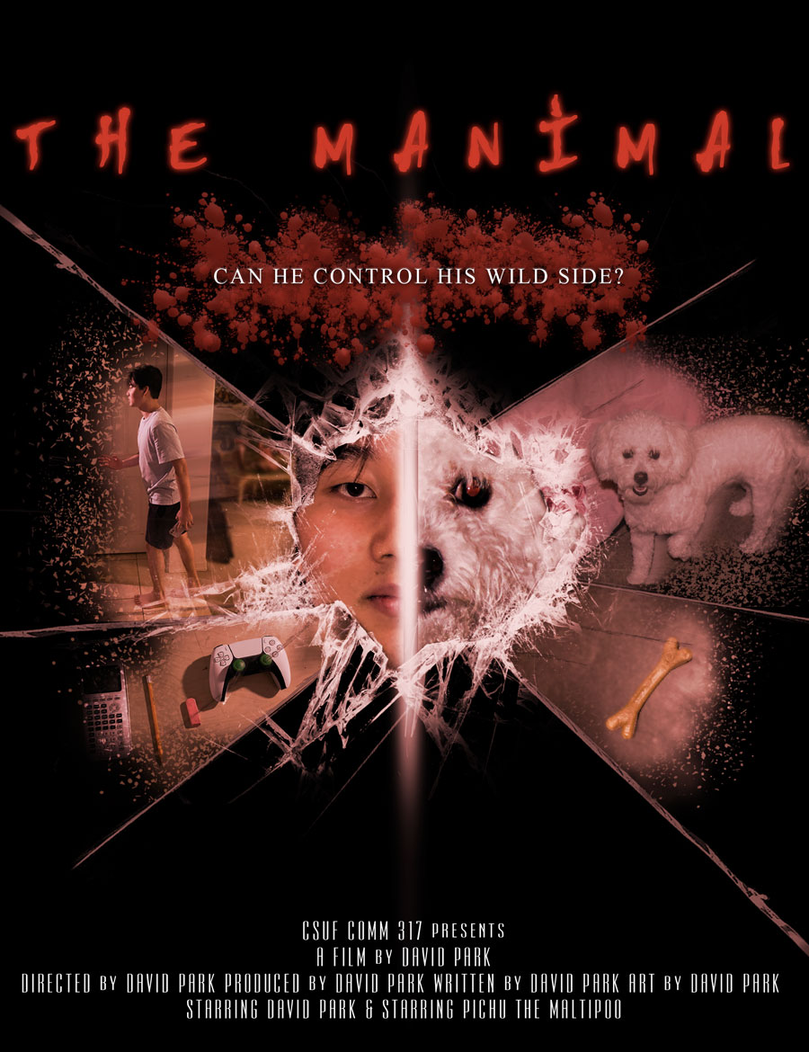
Anthony Saavedra | The techniques are good here – the pixilation, converting the background photo to look like an illustration, getting the dog’s face just right in the space helmet. It really feels like a movie poster with the bold title, the formal symmetrical balance, a compelling focal point (the dog’s face) and cool negative space that provides context.
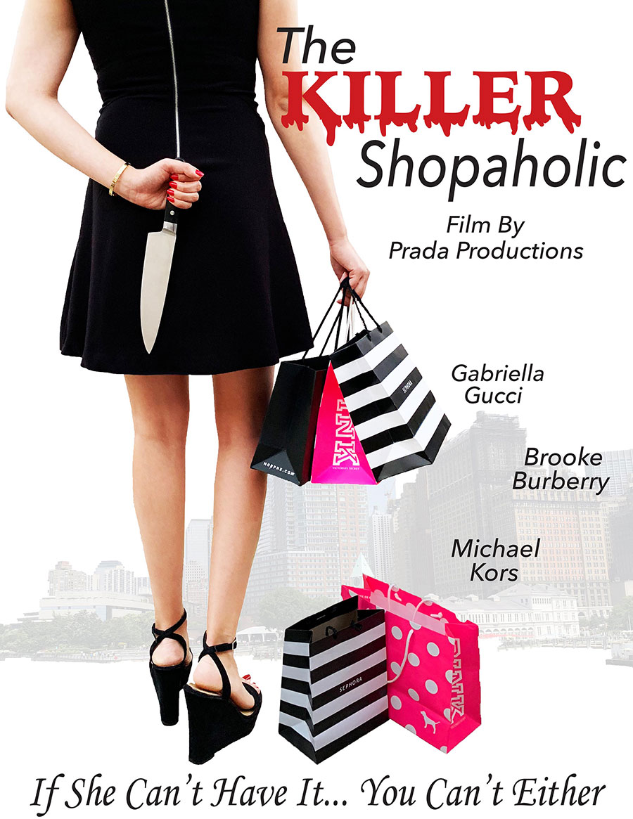
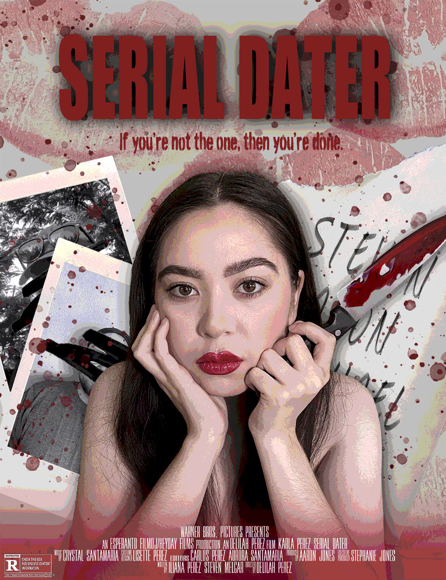
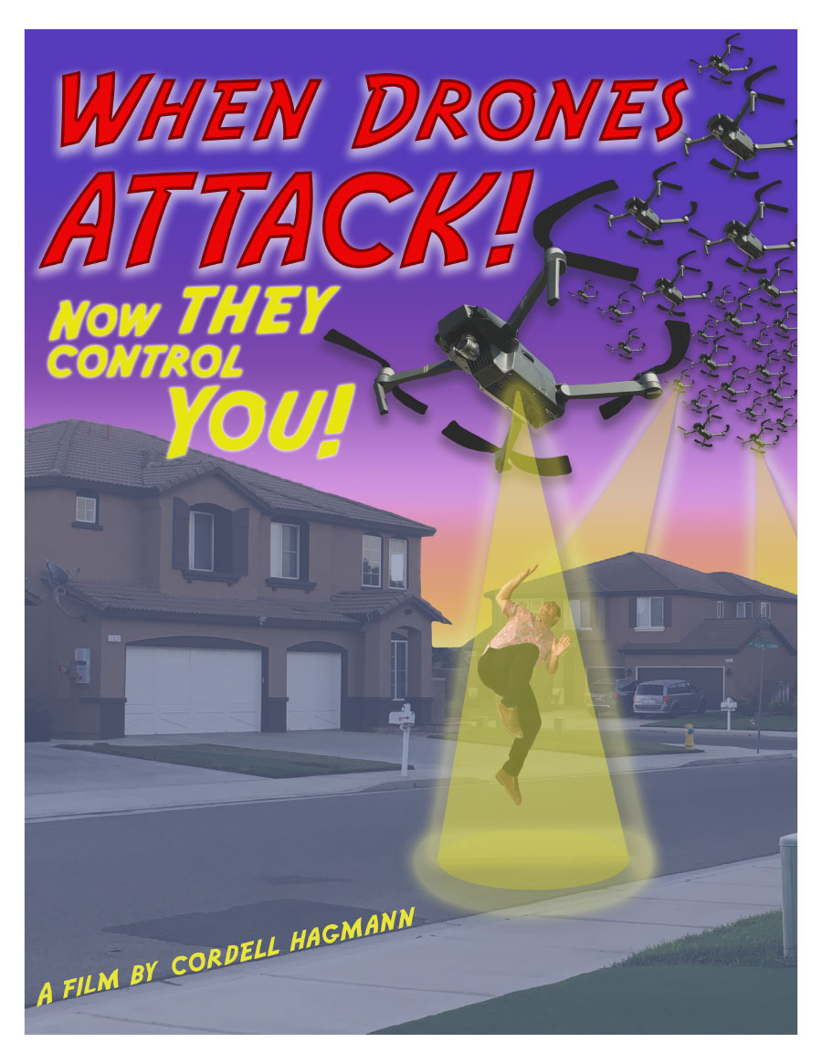
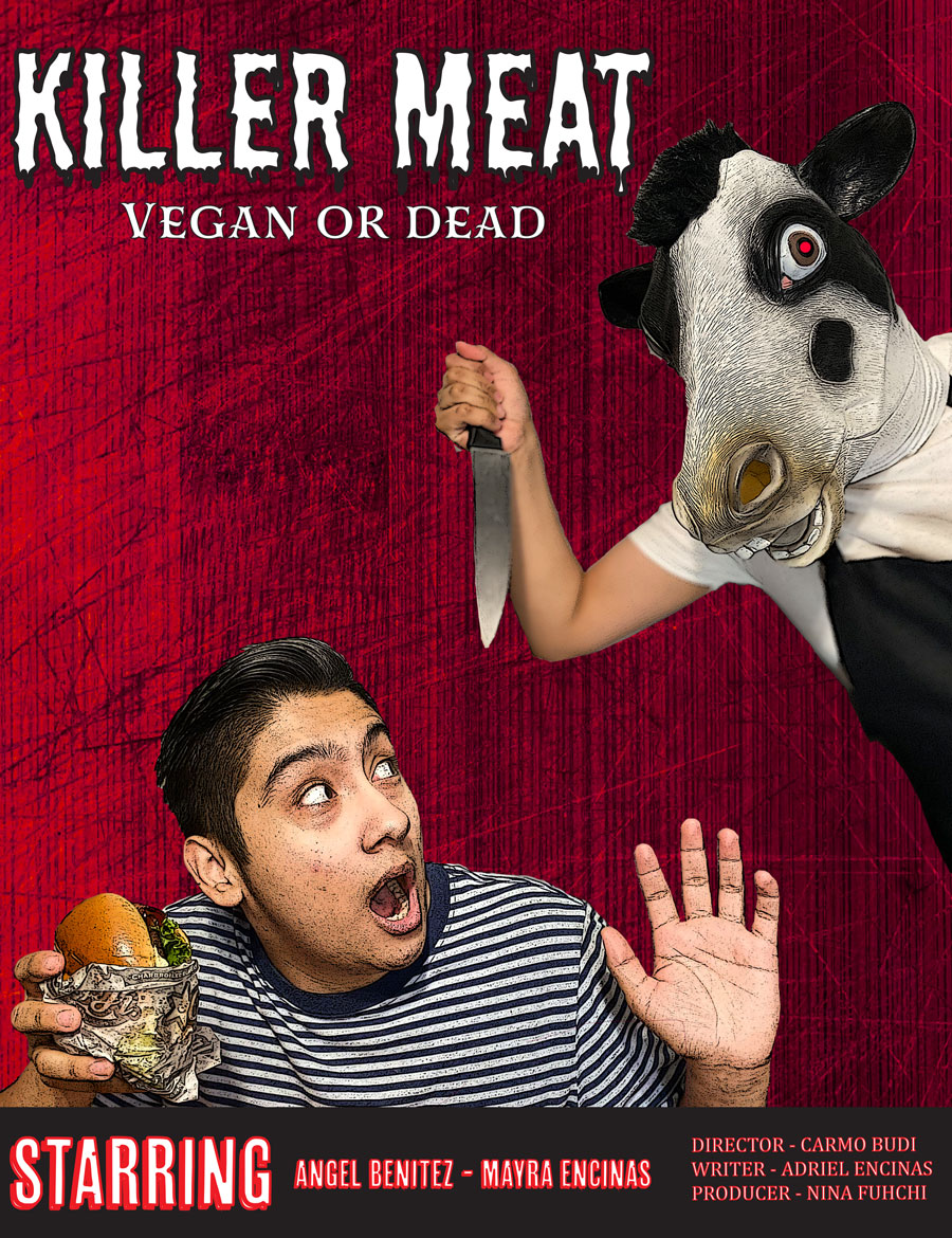
Samantha H | Solid concept, well executed. It covers the basics of at least three images, makes use of opacity, contrast and color to direct eye flow. The selections are good and there is some customized text.
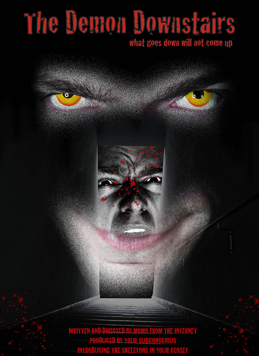
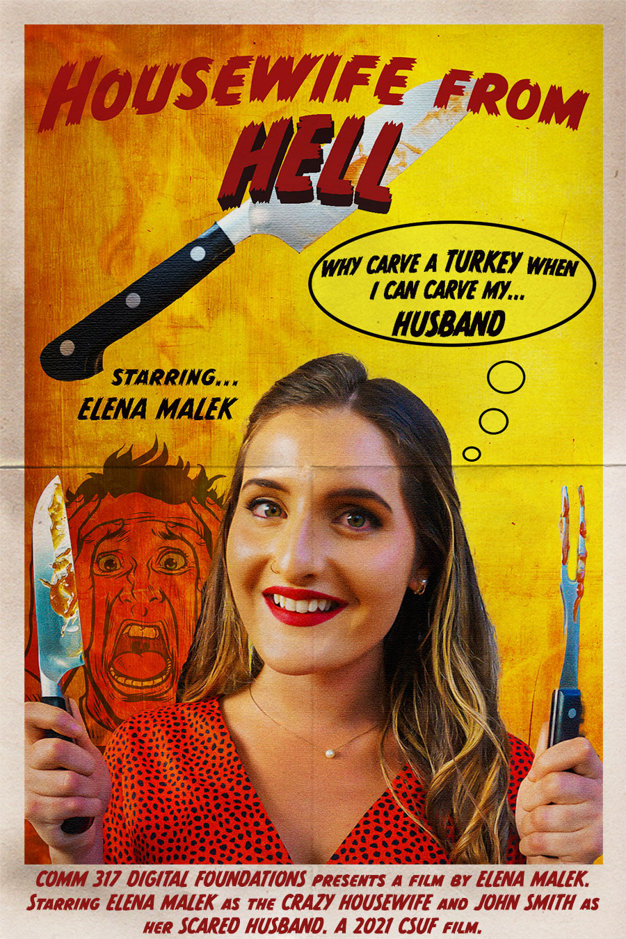
Tanner Stansbury | Whoa! Creepy, well thought out, scary! Seriously, this is a great idea to begin with, with lots of effective Photoshop use of layers, color isolations, etc. Appropriate and creative type treatments and an overall composition that tells the viewer exactly what things to look at and in what order. One of my all-time favorites.
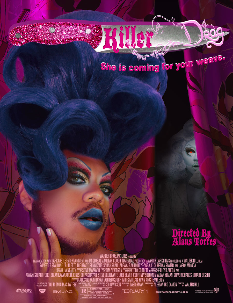
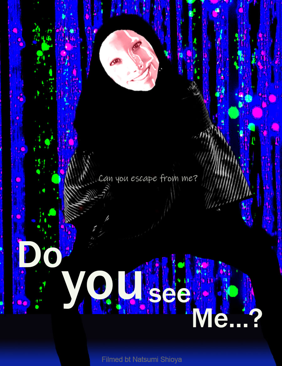
Alans Torres | The placement, size and eyes of the Drag Queen pull the viewer powerfully into this poster. There is no doubt that this is the number one element in the visual hierarchy. Then we see the movie's title and the evil that lurks behind the curtain.
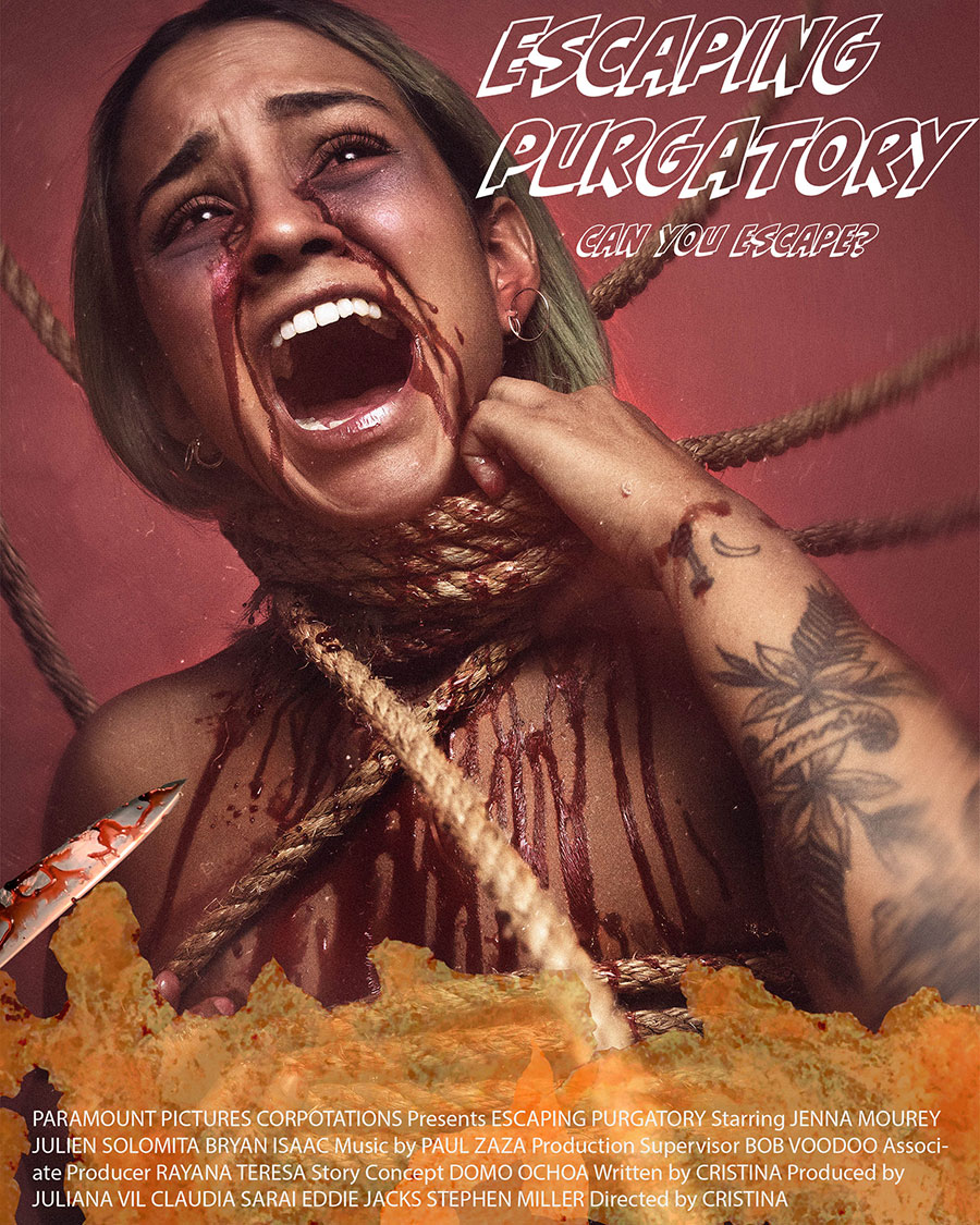
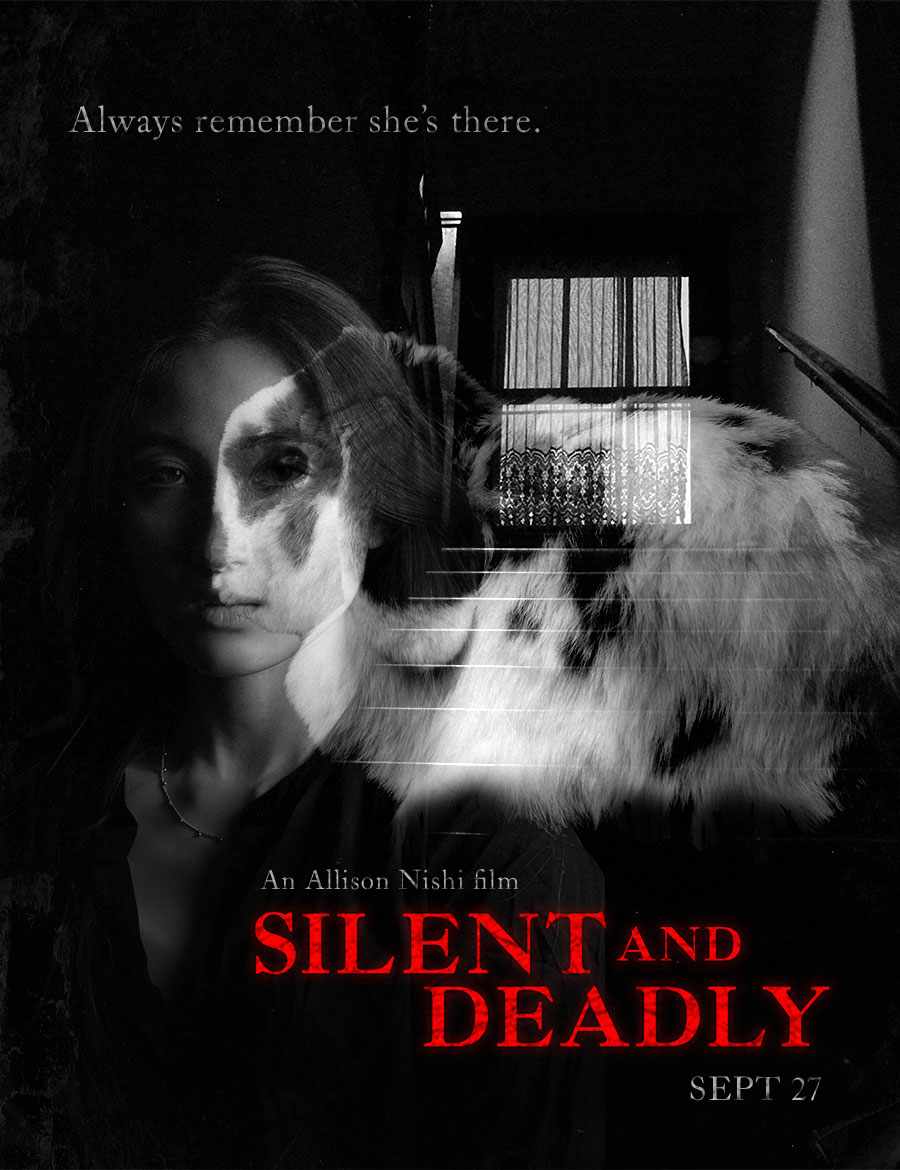
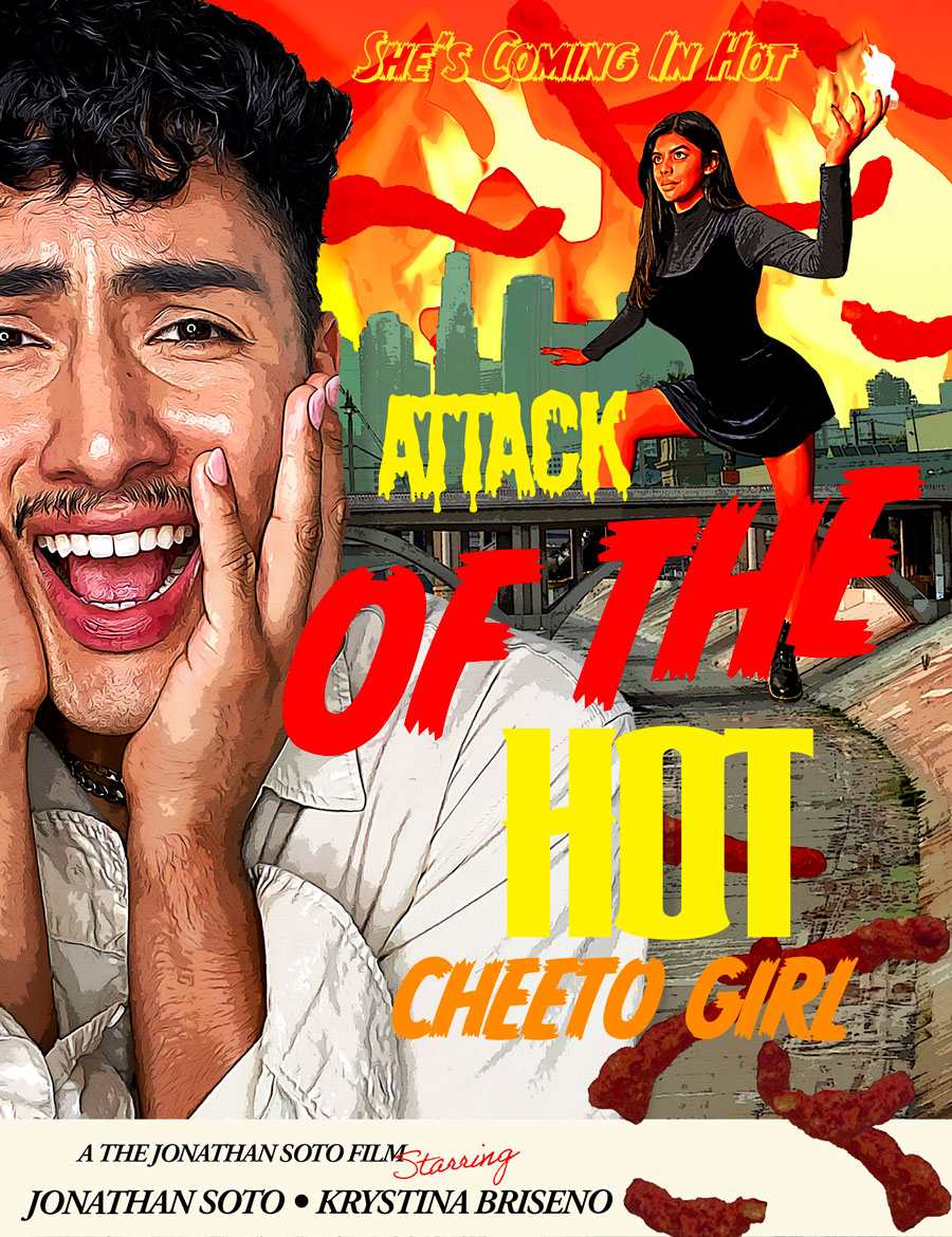
Cristina Villalpando | This highlights the importance of having good friends. The model's expression in this poster dominates the scene enough that I overlook the not-so-great selections or flame. (Flame, like hair, is incredibly difficult to select or move around). The consistent color tones help a lot.
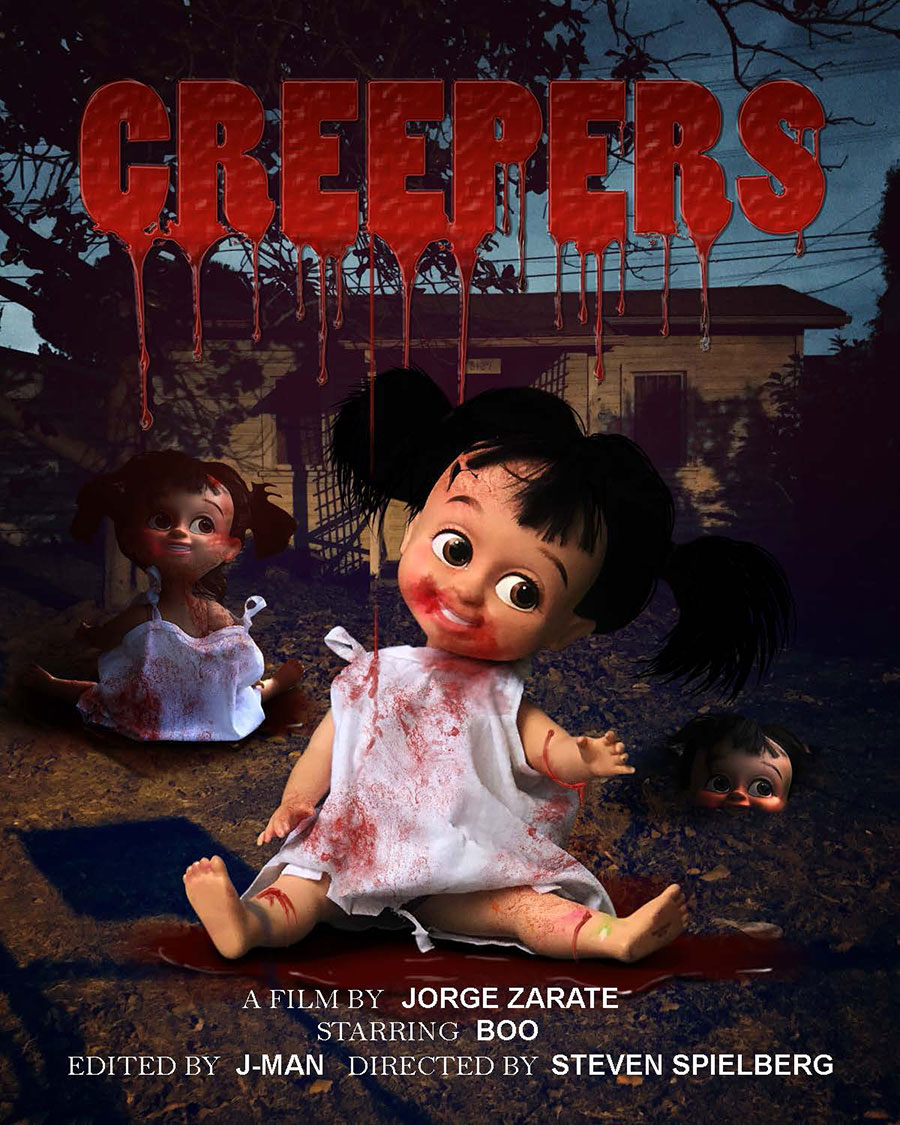
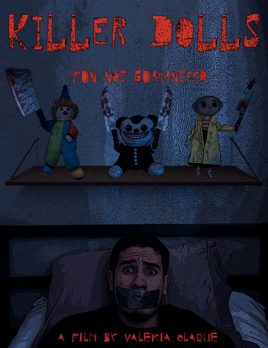
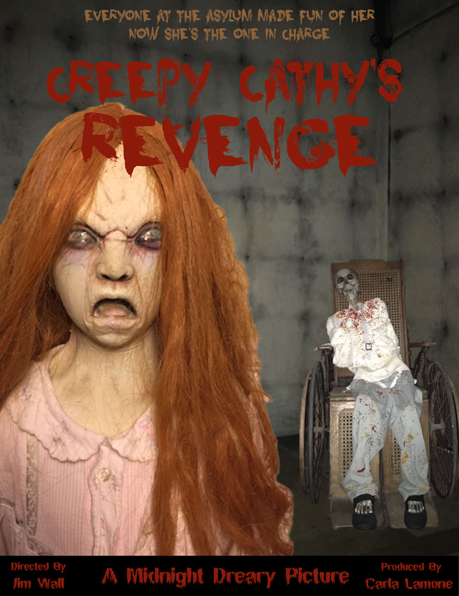
Jorge Zarate | Ugh, I hate dolls. Especially creepy dolls. Here, the idea trumps everything. It's really just three doll shots selected and moved in front of (on top of, layer-wise) an image of a darkened shed or house. But the dramatic lighting adds environmental tone, and the customized text informs what the images may not.