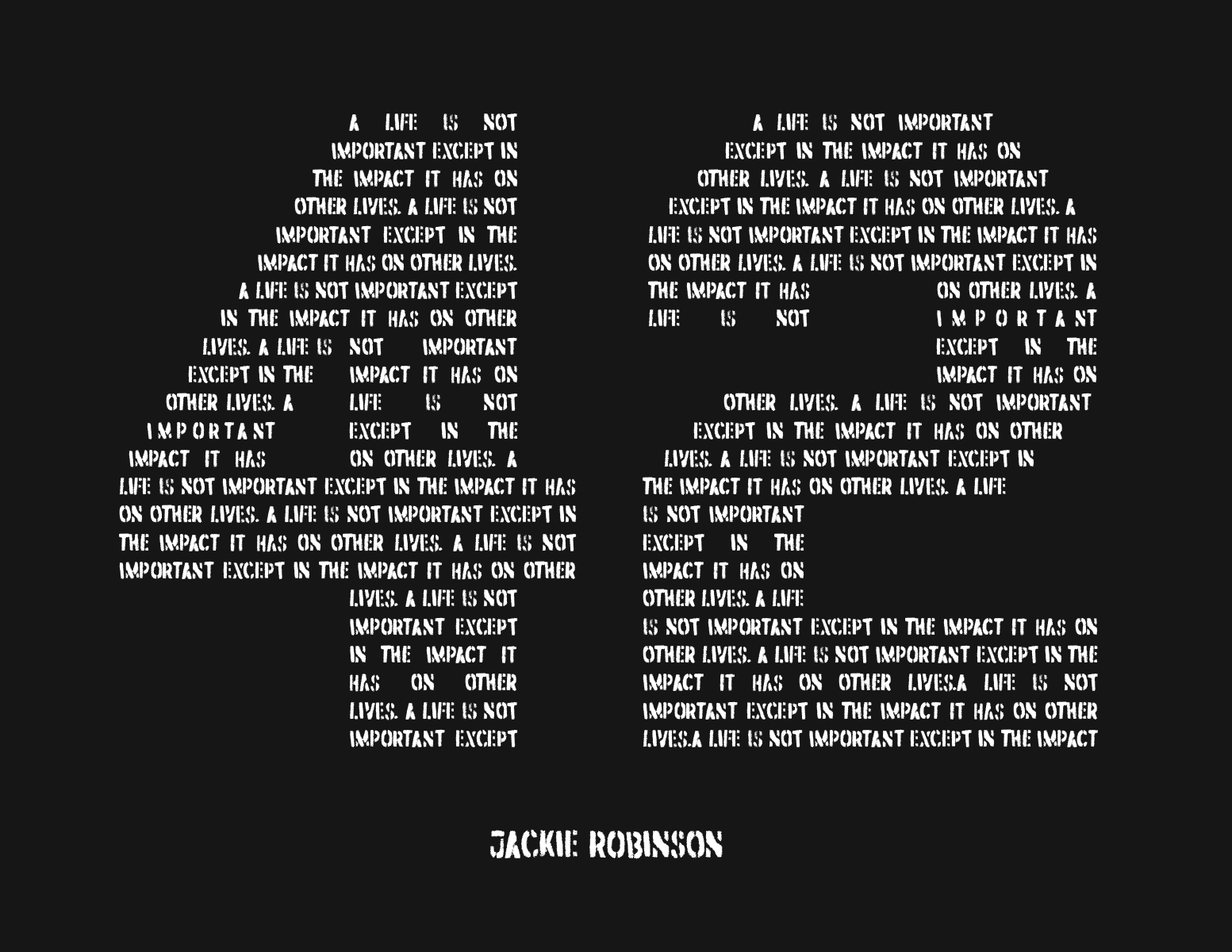
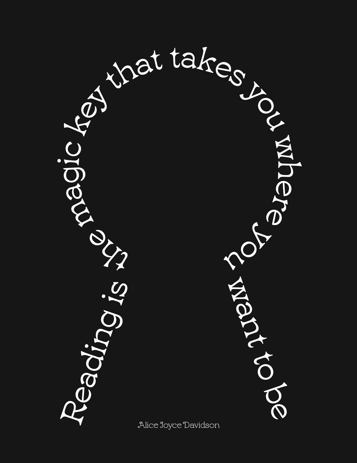
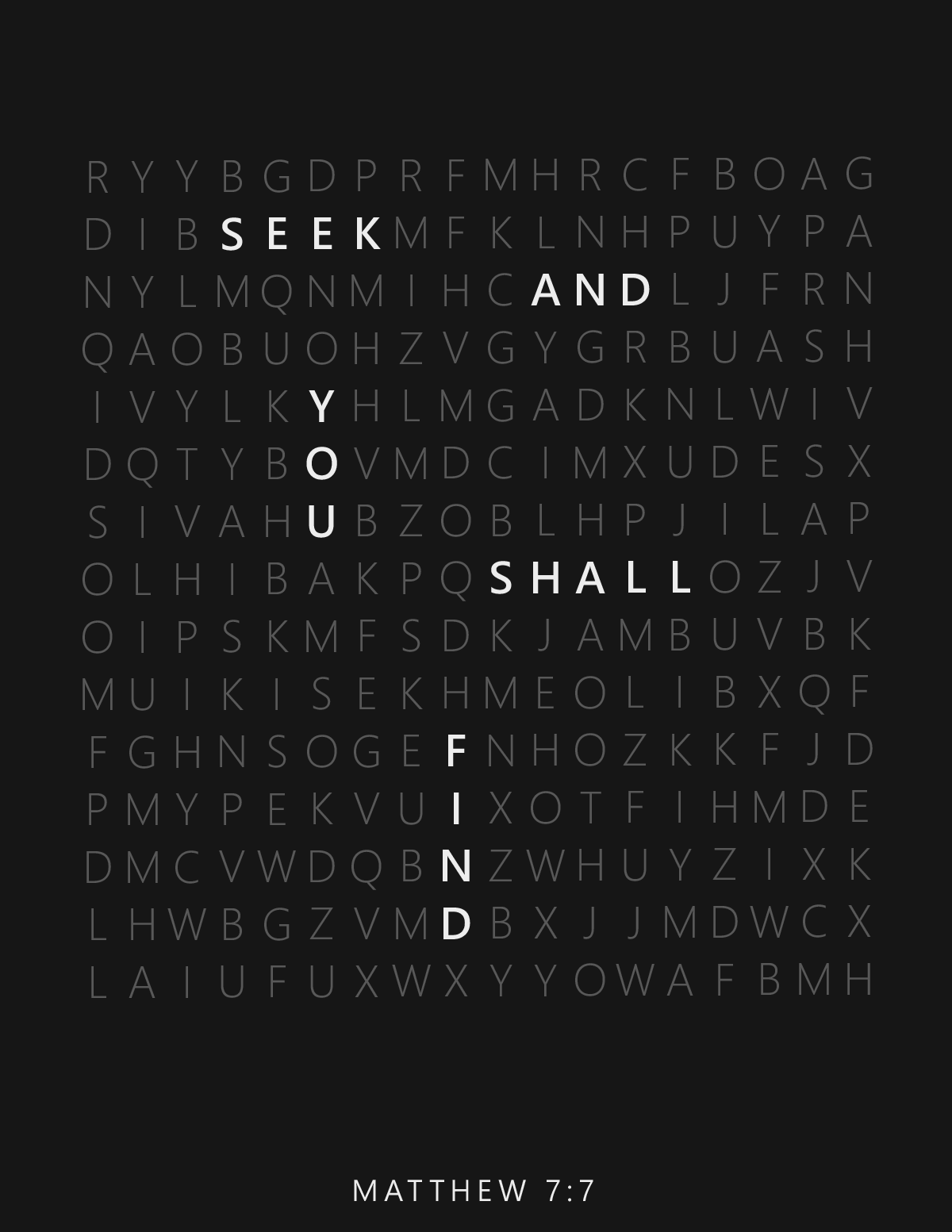
Taylor Arthur | Can you find the word "see"? This type illustration makes you work a little, but not so much that it discourages you. And once you've figured it out you're invested in the idea. Nice use of negative space and good typeface selection.
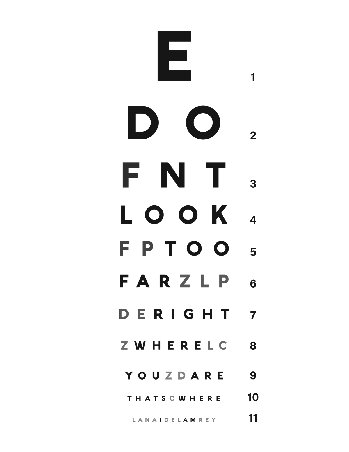
Alex Bosserman | Integration of a familiar idea, icon or visual cliché into your design can reap powerful benefits. Remember that our first goal is always to get the viewer's attention - a familiar idea in an unfamiliar place can do that very well. This is another example of a design that you have to work at a bit, but it's worth the effort. Be careful, though. Don't make the viewer work too hard or you'll lose them.
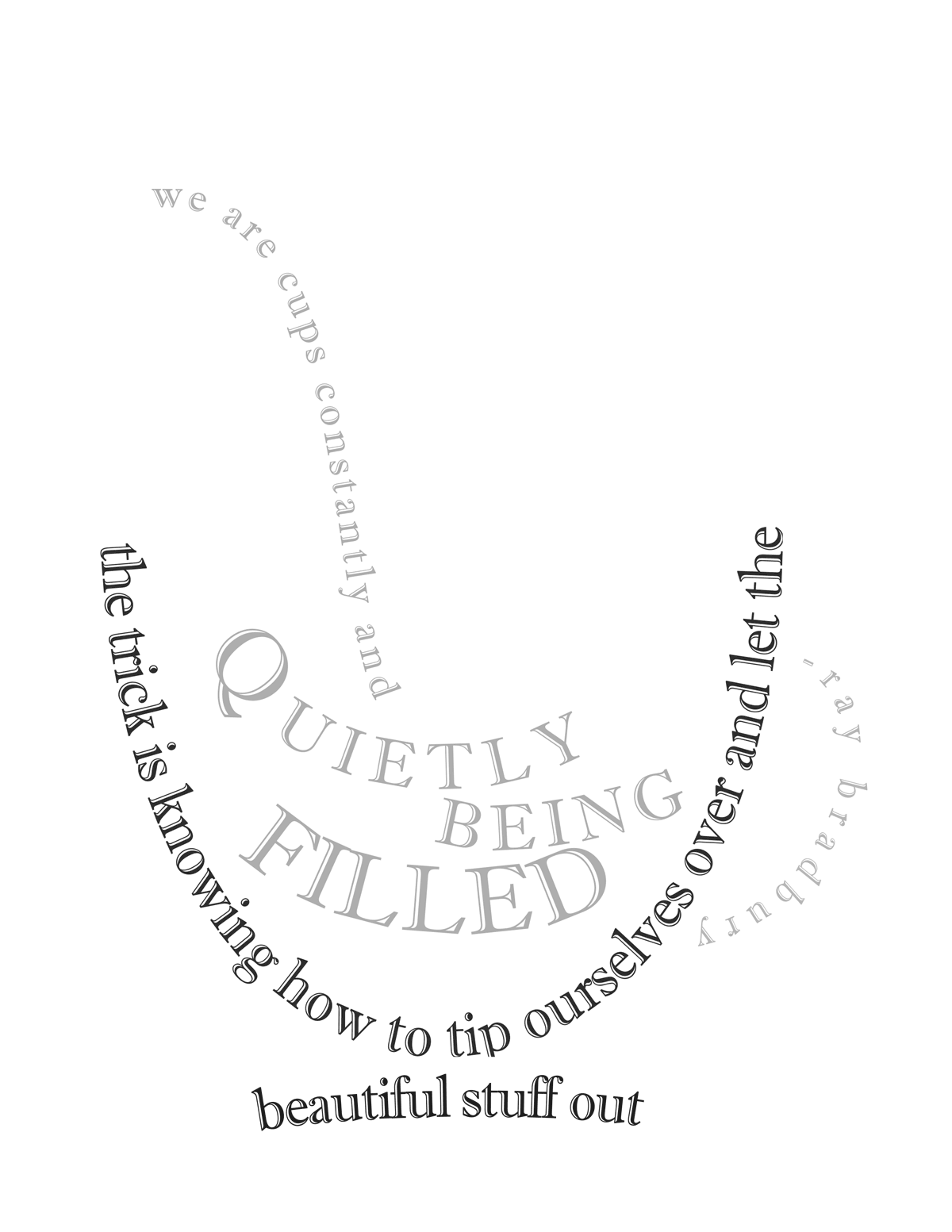
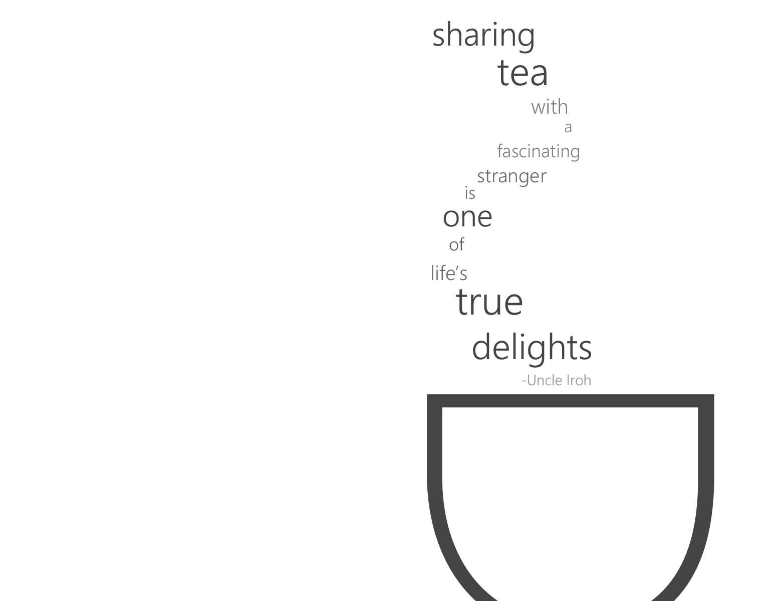
Madisyn Brown | A beautiful typographic illustration using the Type on a Path Tool to create stylized shapes that very simply represent a tea cup. Note where the breaks in the phrase occur - this instructs the viewer on where to insert short pauses when reading the quote. Remember: You control EVERYthing in your layout. Also note the clever integration of the attribute.
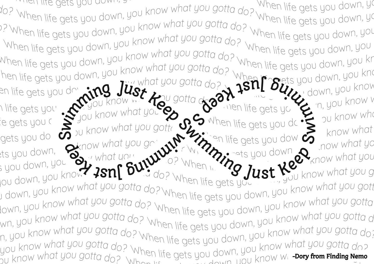
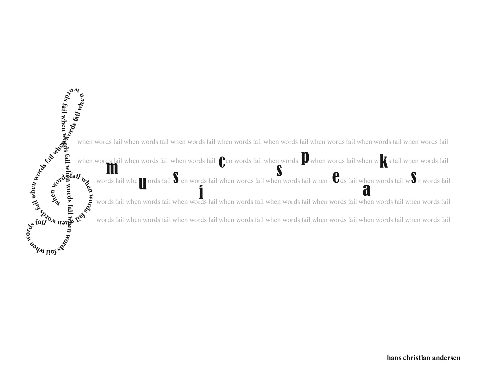
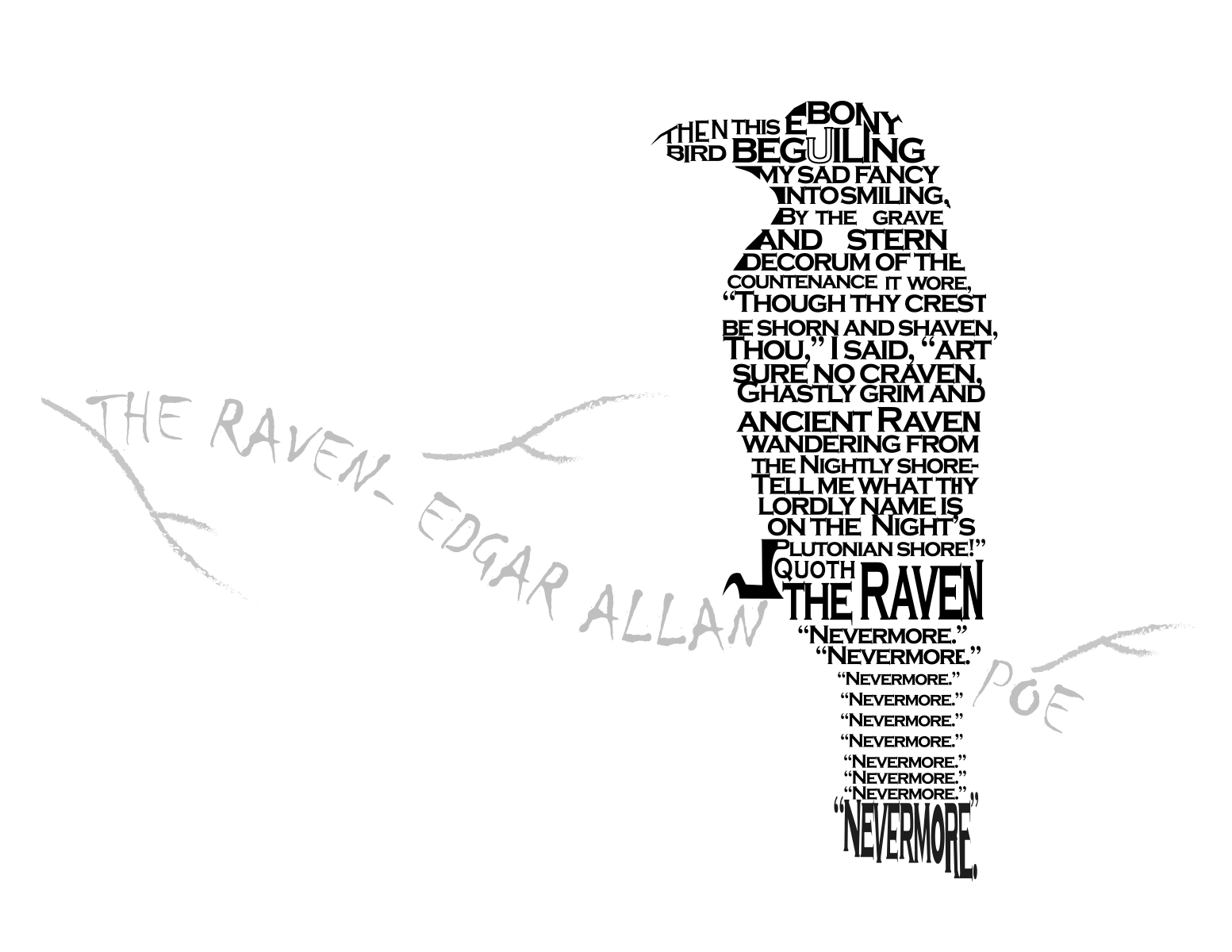
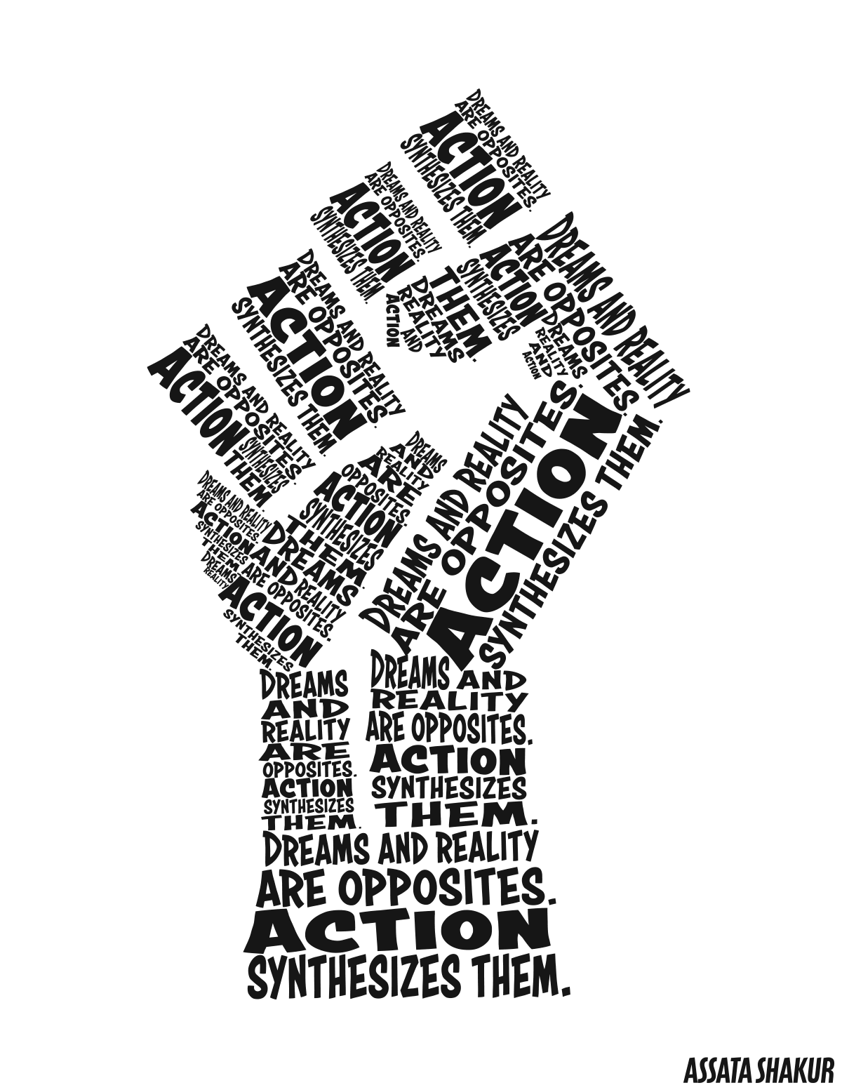
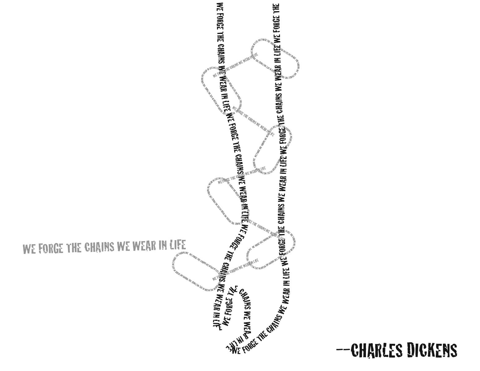
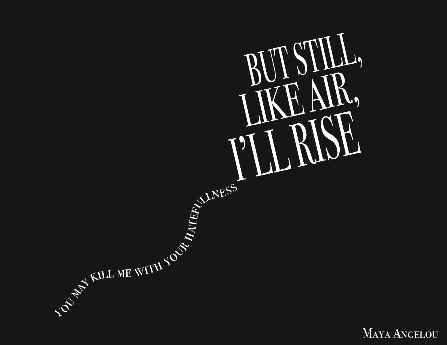
Marissa Cordova | I love how this uses the text formation to illustrate what the words mean. Literally and figuratively.
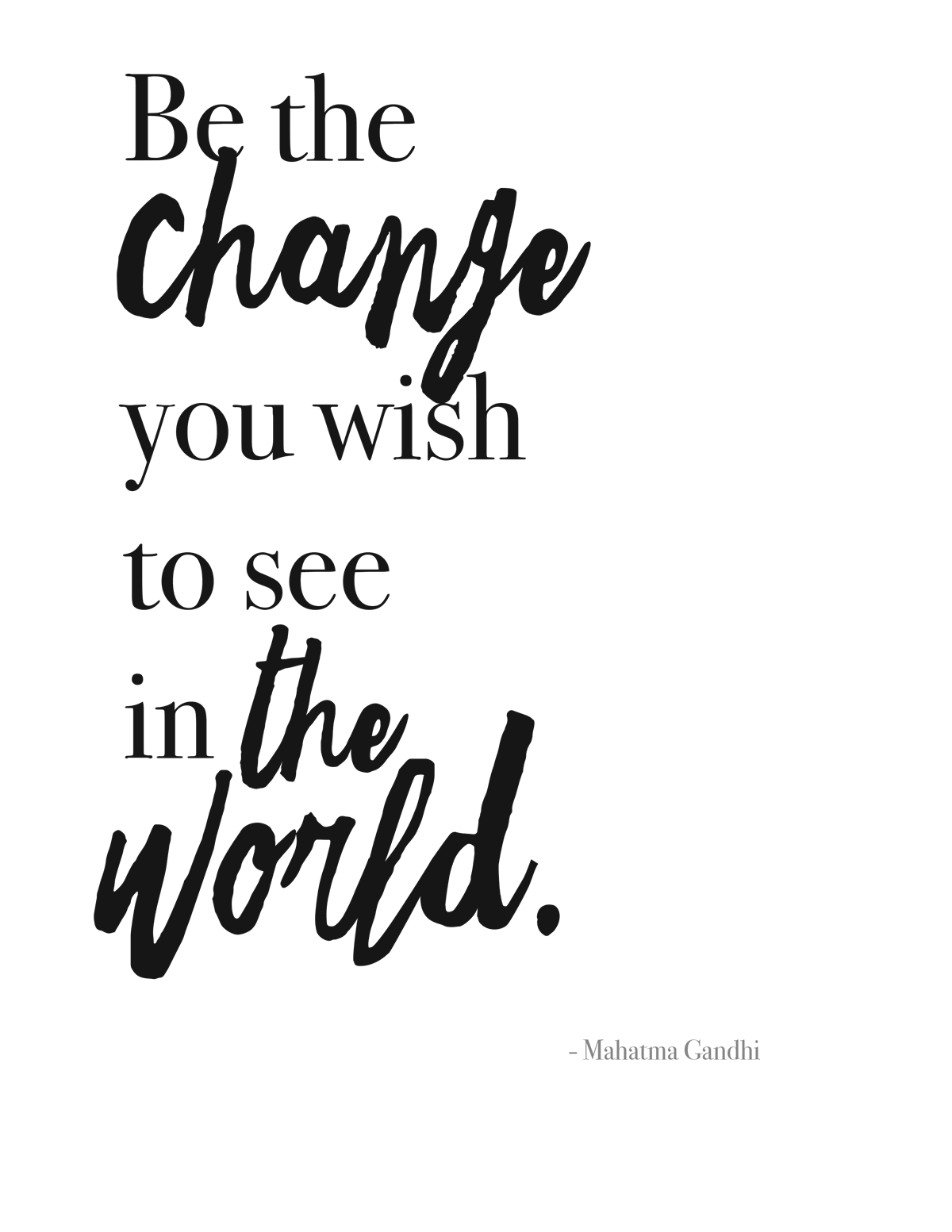
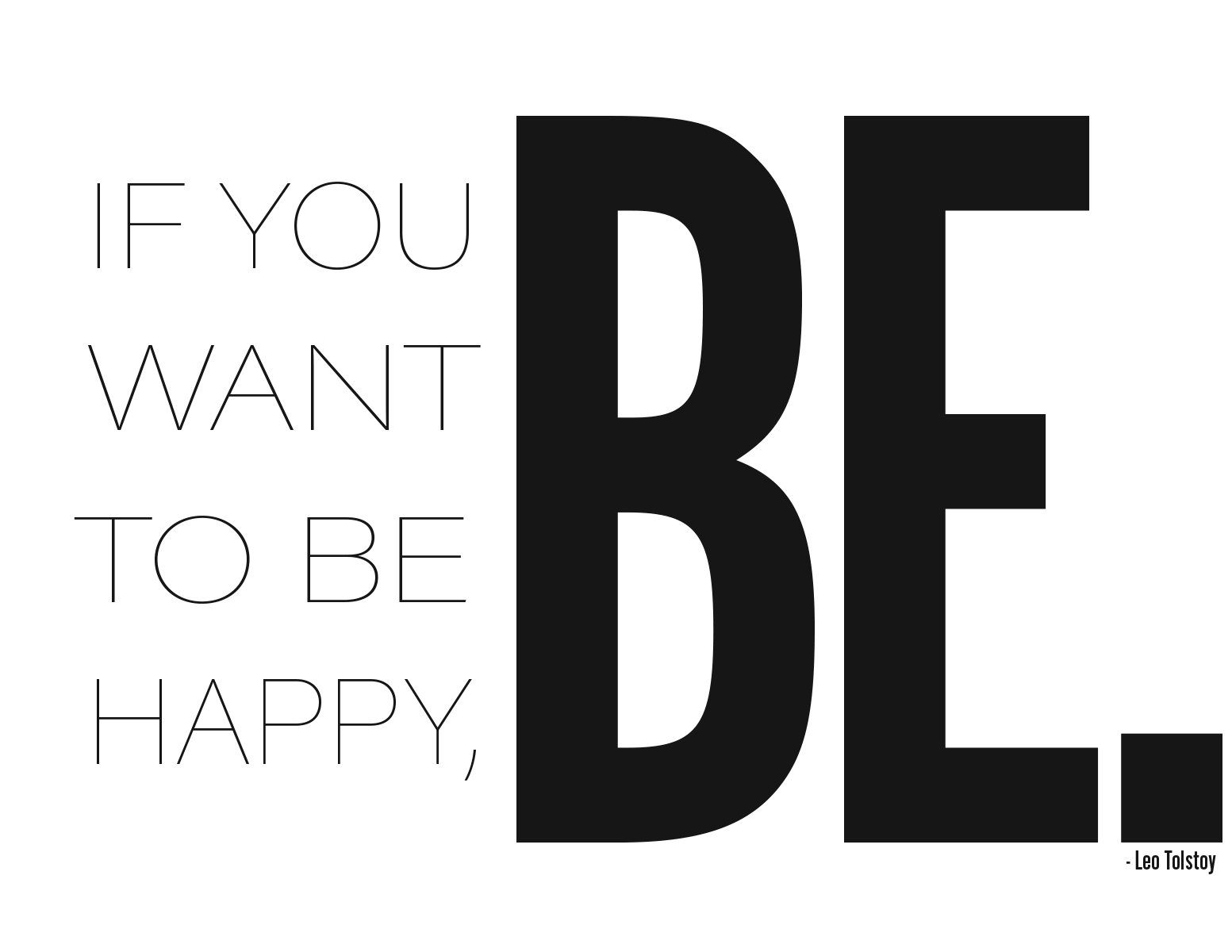
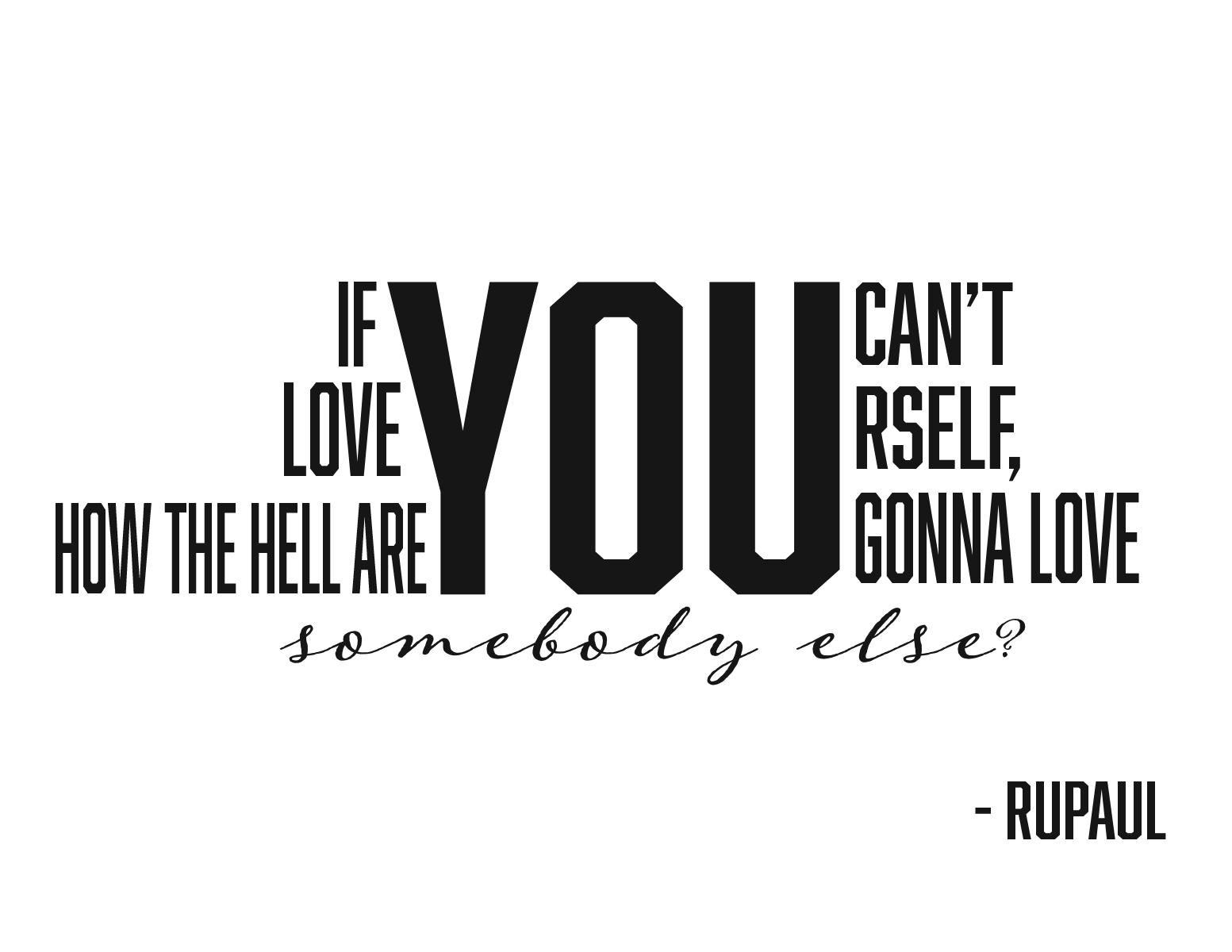
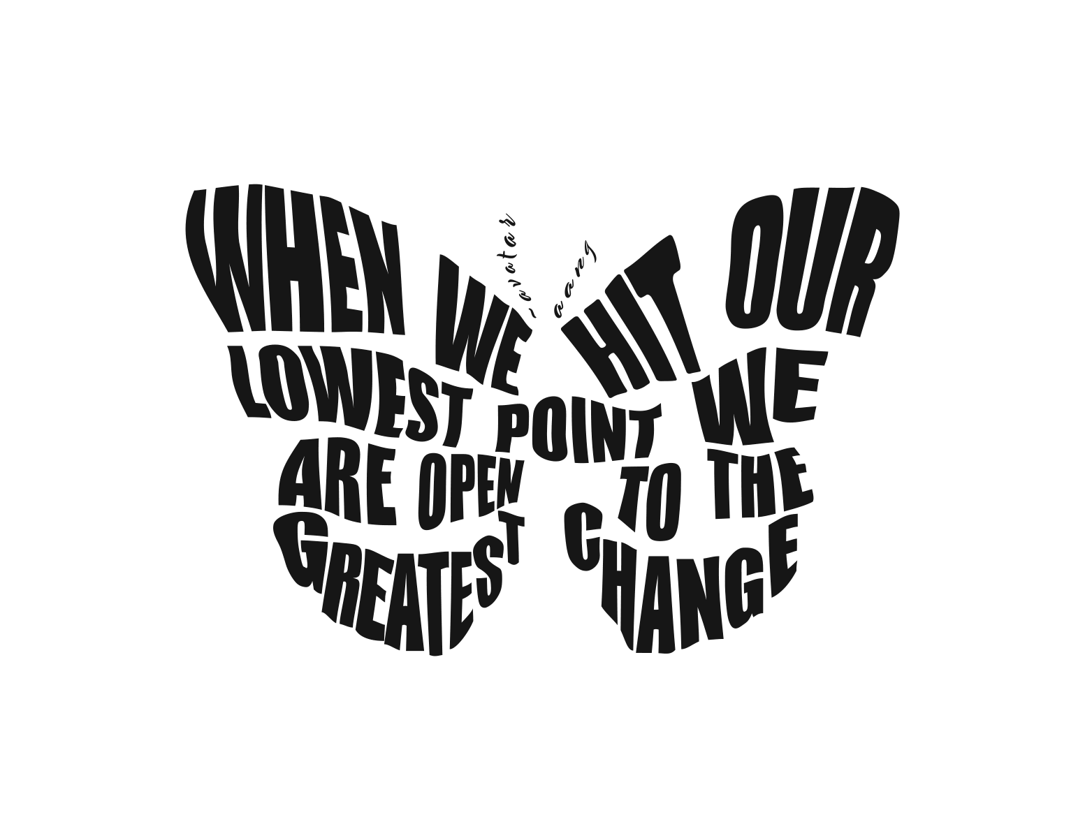
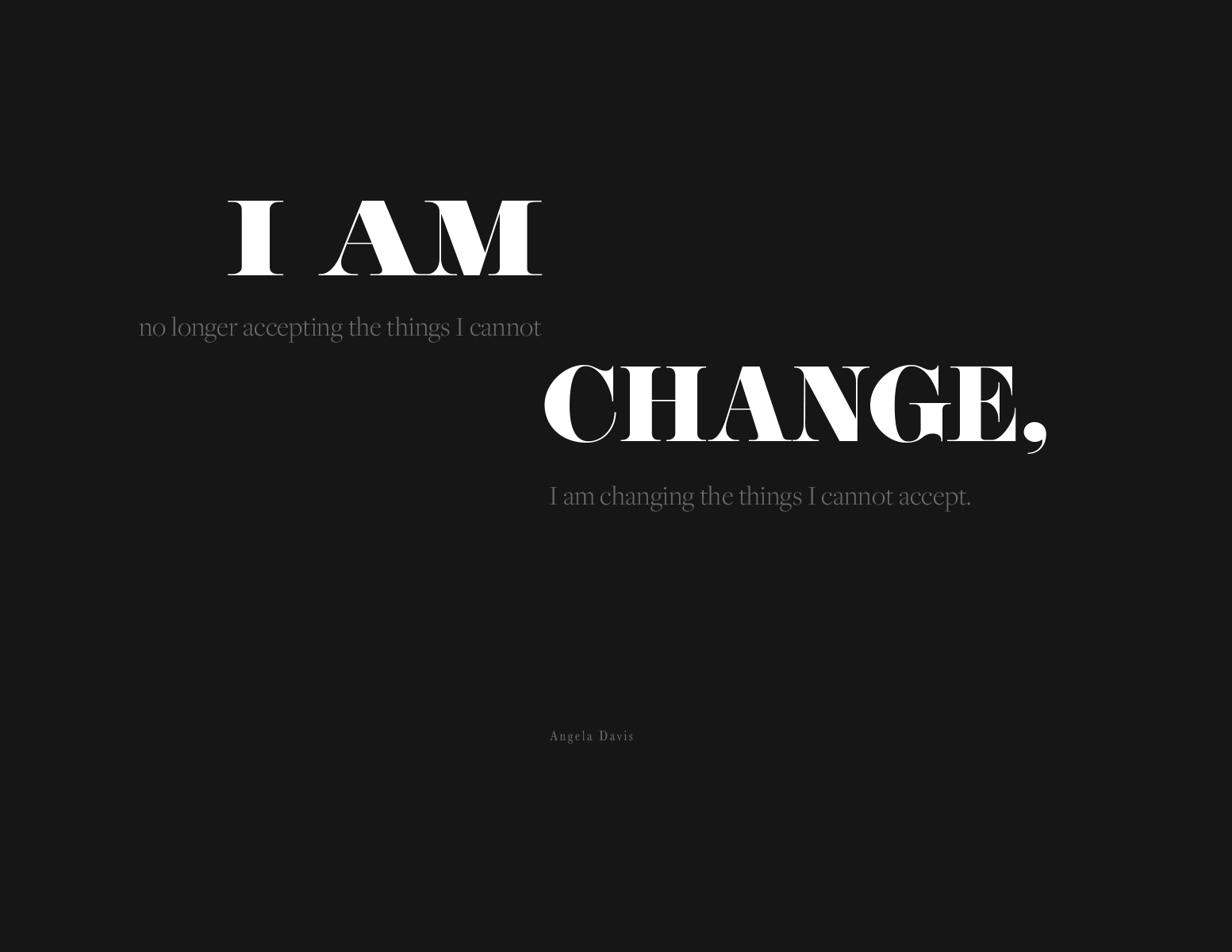
Megan O'Donnell | This design is a wonderful example of type selection, emphasis, simplicity and the powerful use of positive/negative space. When combining two fonts remember that the key is that there is a strong contrast between the two typefaces. You probably read "Change the World" first because of that powerful contrast.
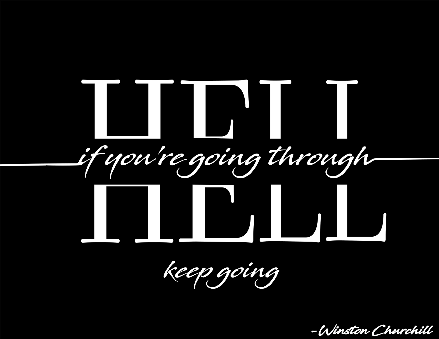
Anthony Saavedra | This concept is a nice combination of being both literal and simple. Even though “HELL” is the biggest element in the layout, it’s broken. So you read “if you’re going through” first. You read this in the order you’re supposed to, and it just works.
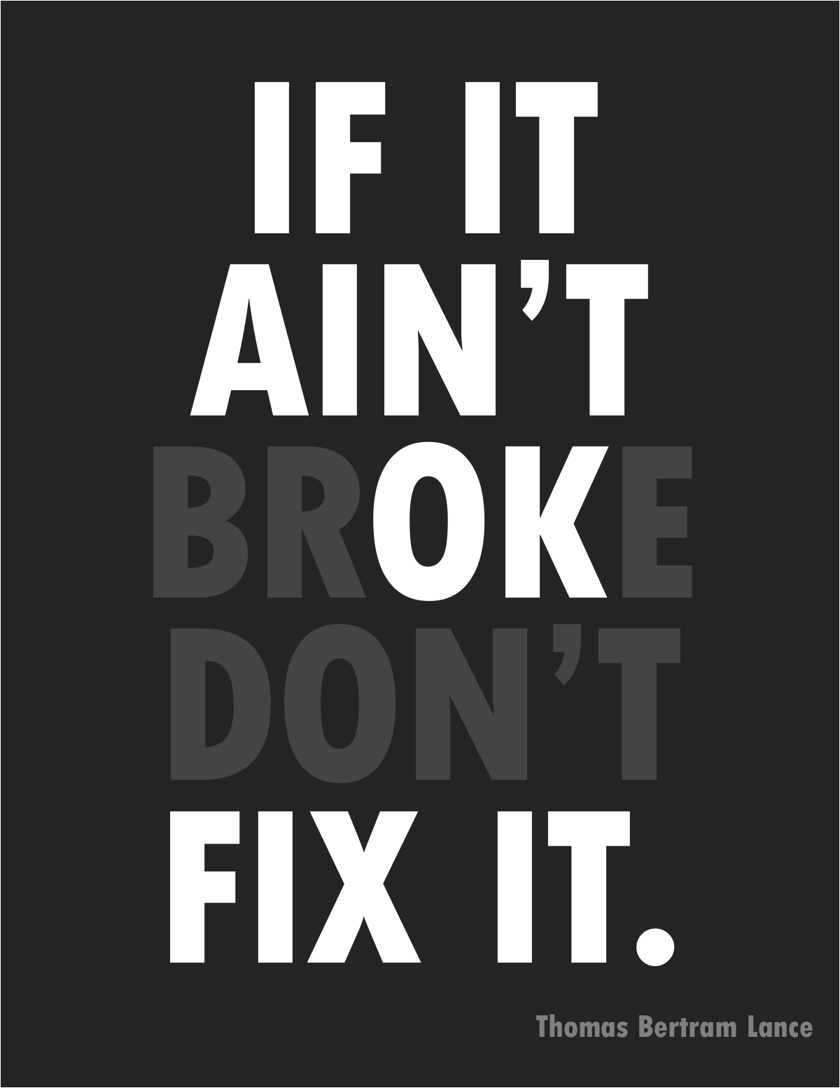
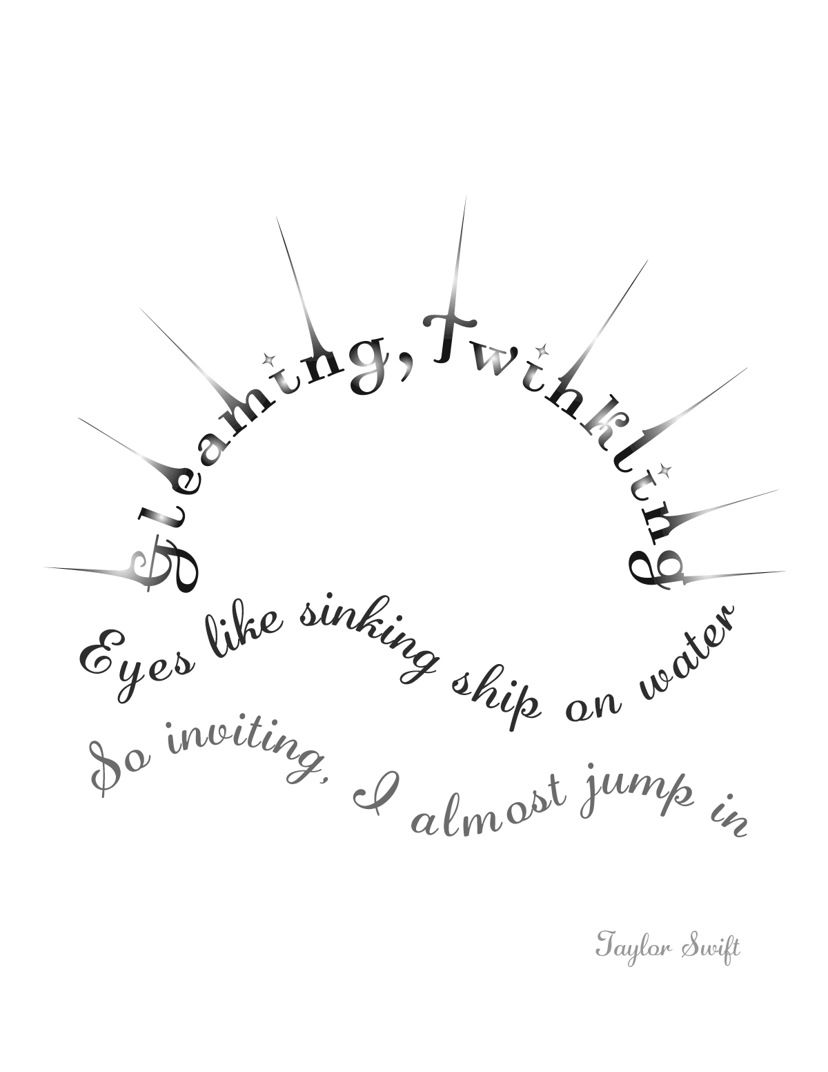
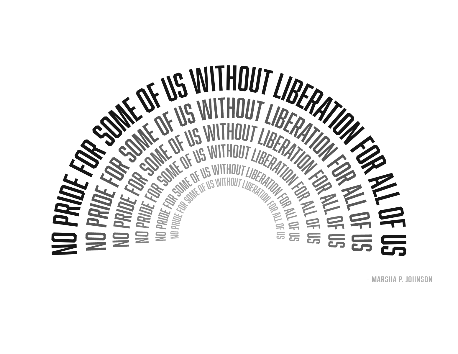
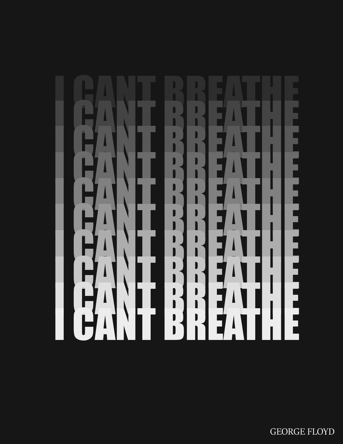
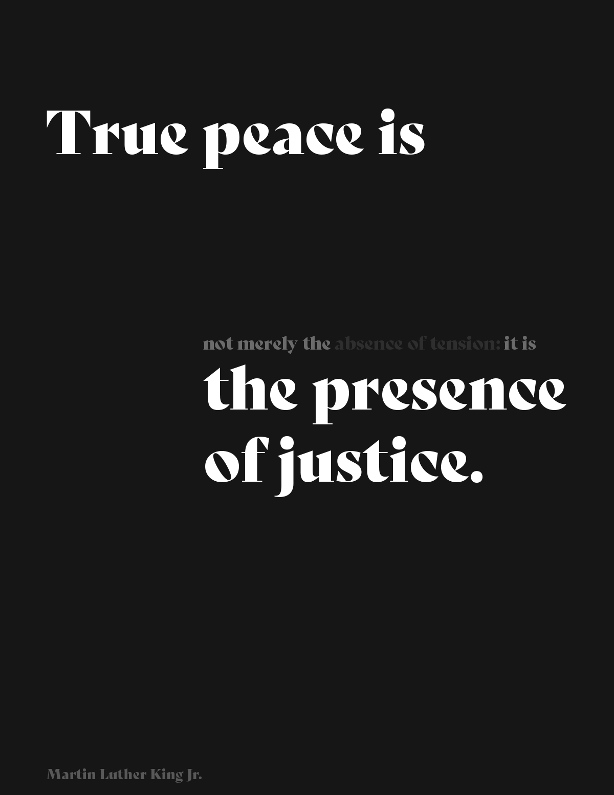
Saika Satake | Pure and simple. The use of size and tonal variations emphasizes the meaning of the quote as well as directing the viewers eye flow from one side to the other.
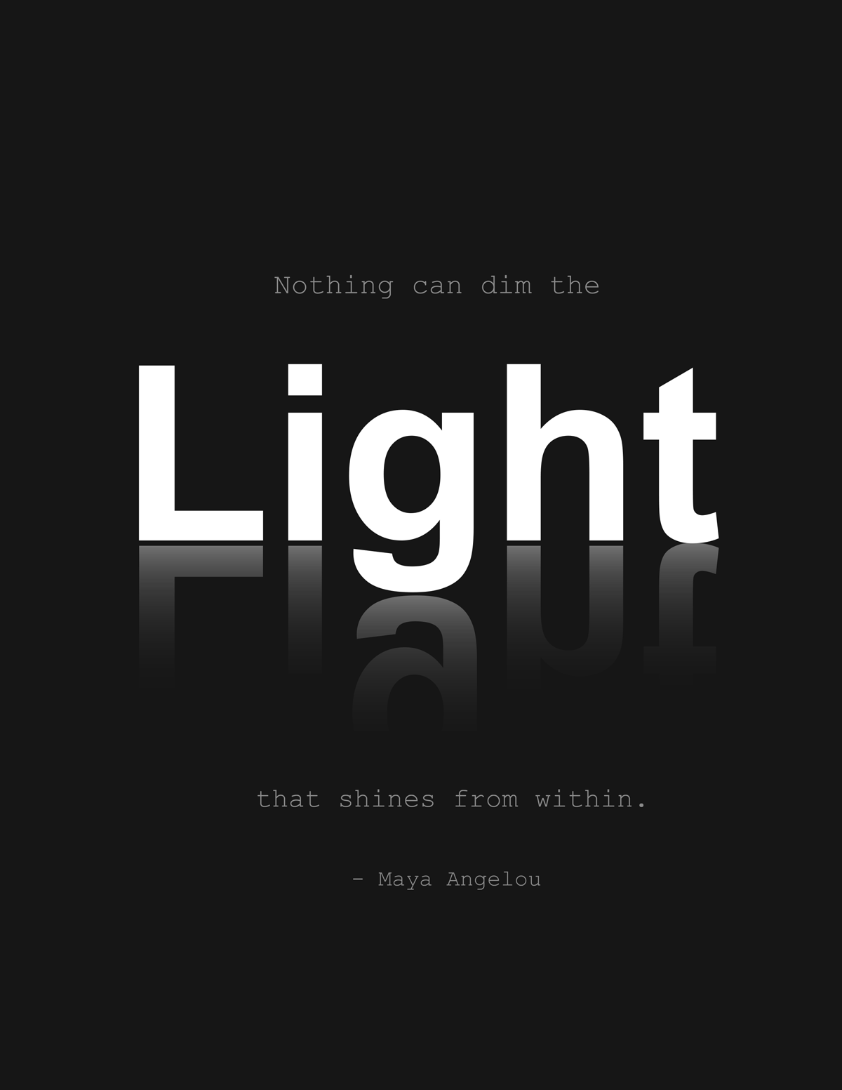
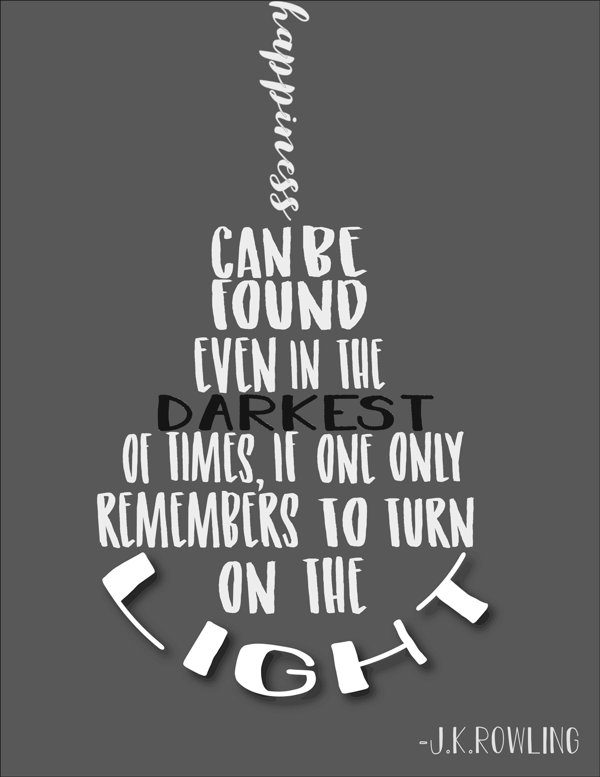
Danielle Zois | Good designs often have one design principle that carries the idea rather than multiple design principles competing for attention. In this one, it’s contrast. The brightness of the word “Light” is what you notice first, but the reflection of the word and the subtle Courier type treatment for the rest of the copy really help emphasize the light, dominant element.